Multiple Choice
The bar graph shows the increasing life expectancy of males in the United States from 1930 to 2010. Use this graph. In which of the years shown was the life expectancy of males in the United States approximately the same? 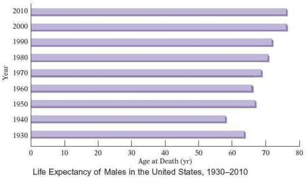
A) 2000 and 2010
B) 2010 and 2020
C) 1990 and 2000
D) 1980 and 2030
E) 2010 and 1990
Correct Answer:

Verified
Correct Answer:
Verified
Q1: Eight health maintenance organizations (HMOs) presented group
Q2: There are 15 students in the medical
Q3: There are approximately 300,000,000 people living in
Q5: A nurse monitors the blood glucose levels
Q6: The bar graph shows the increasing life
Q7: The heart rates of 24 women
Q8: The double-broken-line graph below shows the number
Q9: The circle graph shows the number of
Q10: The cholesterol levels for 100 adults
Q11: The circle graph shows the budget allocation