Multiple Choice
The bar graph shows the increasing life expectancy of males in the United States from 1930 to 2010. Use this graph. Between what two decades shown on the graph did the life expectancy increase by approximately one years? 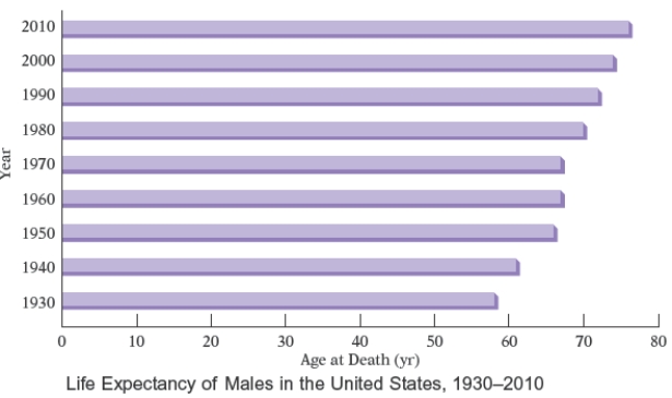
A) 1940 and 1960
B) 1940 and 1950
C) 1950 and 1960
D) 1960 and 1950
E) 1960 and 1970
Correct Answer:

Verified
Correct Answer:
Verified
Q30: The frequency polygon below shows the distances
Q31: Three blue marbles, eight green marbles,
Q32: The times, in seconds, for a 100-meter
Q33: The box-and-whiskers plot below shows the distribution
Q34: The circle graph shows a breakdown,
Q36: The CDC reports that the average length
Q37: The pictograph below shows the approximate
Q38: Suppose that a typical household in the
Q39: An accounting major recorded the number
Q40: The bar graph below shows the