Multiple Choice
The data below are the number of cattle on farms in the United States (in millions) for each year that
Begins a decade from 1910 to 2010. Draw a box plot for the data below. Are there any outliers? If
So, what are they? 
A) 
B) 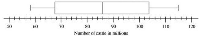
C) 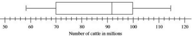
D) 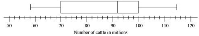
Correct Answer:

Verified
Correct Answer:
Verified
Q66: Construct a bar graph for the number
Q67: To find the arrange the data in
Q68: The average hourly wage of employees of
Q69: For the following data<br>(a)Draw a scatter plot.<br>(b)Find
Q70: Find the midrange. <img src="https://d2lvgg3v3hfg70.cloudfront.net/TB8446/.jpg" alt="Find the
Q72: Draw a bar graph illustrating the change
Q73: Select the graph below that best represents
Q74: Which data set would be likely to
Q75: The average hourly wage of employees of
Q76: Find the value for the correlation coefficient