Essay
Draw a bar graph illustrating the change in a state's tax rate on each of the axes below. Note that
you'll be using the same information on each graph. 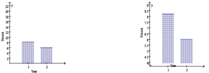
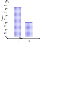 Which of the two bar graphs would be used by someone wanting to argue that this tax cut will have a
devastating effect on the state's budget? Why?
Correct Answer:

Verified
The graph on the right. If mak...View Answer
Unlock this answer now
Get Access to more Verified Answers free of charge
Correct Answer:
Verified
View Answer
Unlock this answer now
Get Access to more Verified Answers free of charge
Q67: To find the arrange the data in
Q68: The average hourly wage of employees of
Q69: For the following data<br>(a)Draw a scatter plot.<br>(b)Find
Q70: Find the midrange. <img src="https://d2lvgg3v3hfg70.cloudfront.net/TB8446/.jpg" alt="Find the
Q71: The data below are the number of
Q73: Select the graph below that best represents
Q74: Which data set would be likely to
Q75: The average hourly wage of employees of
Q76: Find the value for the correlation coefficient
Q77: These data represent the number of students