Multiple Choice
What could the following graph reasonably represent?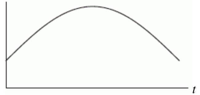
A) The average daily temperature of Denver over a one-year time period with being July 1.
B) The average daily temperature of Denver over a one-year time period with being January 1.
C) The population of Denver between 1900 and 2000 with being 1900 .
D) The infant mortality rate in Denver between 1900 and 2000 with being 1900.
Correct Answer:

Verified
Correct Answer:
Verified
Q10: The following tables give the profits
Q11: The table below gives the deer population
Q12: A cookie store has a fixed
Q13: Which of the following figures shows
Q14: Suppose there are 100 people living in
Q16: If <span class="ql-formula" data-value="f(x)"><span class="katex"><span
Q17: The following figure show the distance of
Q18: At a price of <span
Q19: Mark all of the following functions
Q20: For the line <span class="ql-formula"