Short Answer
Figure 52.10 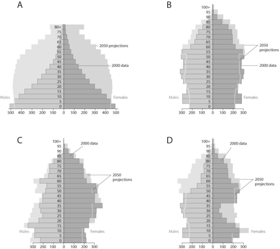
-Based on the diagrams in Figure 52.10 and on the large population of baby boomers in the United States,what graph best reflects U.S.population in 20 years?
Correct Answer:

Verified
Correct Answer:
Verified
Q21: Figure 52.6 <img src="https://d2lvgg3v3hfg70.cloudfront.net/TB3734/.jpg" alt="Figure 52.6
Q22: It is estimated that snow geese will
Q23: Figure 52.12 <img src="https://d2lvgg3v3hfg70.cloudfront.net/TB3734/.jpg" alt="Figure 52.12
Q24: If 40 individuals were alive in 1921
Q25: Figure 52.3 <img src="https://d2lvgg3v3hfg70.cloudfront.net/TB3734/.jpg" alt="Figure 52.3
Q27: Figure 52.3 <img src="https://d2lvgg3v3hfg70.cloudfront.net/TB3734/.jpg" alt="Figure 52.3
Q28: Figure 52.6 <img src="https://d2lvgg3v3hfg70.cloudfront.net/TB3734/.jpg" alt="Figure 52.6
Q29: Figure 52.7 <img src="https://d2lvgg3v3hfg70.cloudfront.net/TB3734/.jpg" alt="Figure 52.7
Q30: Figure 52.5 <img src="https://d2lvgg3v3hfg70.cloudfront.net/TB3734/.jpg" alt="Figure 52.5
Q31: Projections for Earth's human population by 2050