Marketing Dashboard Map -In the Marketing Dashboard Map Above,the Annual Growth Rate in Above,the
Multiple Choice
Marketing Dashboard Map
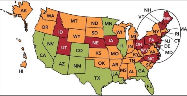
-In the Marketing Dashboard Map above,the annual growth rate in each state is shown,with green (which looks gray on gray scale) meaning good and red (which looks black on gray scale) meaning very poor.If you were a marketing manager faced with this dashboard,which of the following would be the best action?
A) Focus on the shortfalls in Idaho and Utah.
B) Revise the relevant goals for both the East and West Coast.
C) Conduct additional market research in the southern United States.
D) Examine your distribution system in the northeastern United States.
E) Change the marketing metric being used to evaluate the states individually.
Correct Answer:

Verified
Correct Answer:
Verified
Q20: One of the eight primary marketing-related reasons
Q22: Market testing refers to<br>A)exposing actual products to
Q24: Marketers pay slotting fees to grocers in
Q28: All of the following are sources for
Q30: A product that has tangible attributes that
Q33: The new-product development process an organization goes
Q68: New-product or service failures may be reduced
Q125: One reason new products fail is that
Q149: A product line refers to<br>A) a product
Q190: You greatly admire a set of Waterford