Multiple Choice
The following graphic of cigarettes smoked (sold) per capita (CIG) and deaths per 100K population from lung cancer (LUNG) indicates _________ 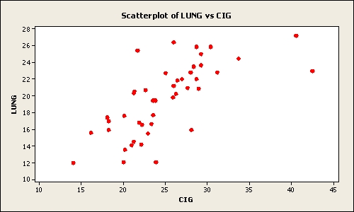
A) a weak relation between the two variables
B) a pretty strong relation between the two variables
C) when the number of cigarettes smoked (sold) per capita (CIG) increases the deaths per 100K population from lung cancer (LUNG) decreases
D) a negative relation between the two variables
E) no relation between the two variables
Correct Answer:

Verified
Correct Answer:
Verified
Q3: The cumulative frequency for a class is
Q20: The staff of Mr.Wayne Wertz,VP of Operations
Q22: The following graphic of residential housing data
Q24: The following is a bar chart of
Q25: The 2010 and 2012 market share data
Q45: One rule that must always be followed
Q48: A scatter plot is a two-dimensional graph
Q59: One advantage of a stem and leaf
Q69: A scatter plot shows how the numbers
Q89: An instructor made a frequency table