Multiple Choice
What type of graph is the figure below? 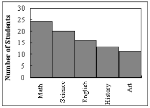
A) Pareto chart
B) pictograph
C) ogive
D) pie graph
Correct Answer:

Verified
Correct Answer:
Verified
Related Questions
Q31: Greg wants to construct a frequency distribution
Q33: How many values are in the data
Q35: Which of the following is a histogram?<br>A)
Q37: What is the lower class limit in
Q37: Given the following two sets of data,
Q40: The percentages of white, wheat, and rye
Q41: Which graph should be used to represent
Q54: The cumulative frequency for a class is
Q73: A pie graph would best represent the
Q104: If the graph of a frequency distribution