Multiple Choice
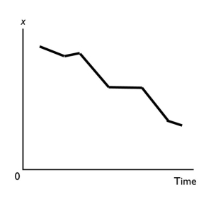
-A graph shows the average wage of various demographic groups in 2012.The kind of graph used to show these data would be a
A) scatter diagram.
B) time-series graph.
C) cross-section graph.
D) Venn diagram.
E) fixed-year figure.
Correct Answer:

Verified
Correct Answer:
Verified
Q106: <img src="https://d2lvgg3v3hfg70.cloudfront.net/TB8586/.jpg" alt=" -The figure above
Q273: Why do economists use graphs?
Q322: <img src="https://d2lvgg3v3hfg70.cloudfront.net/TB1458/.jpg" alt=" -The table above
Q323: <img src="https://d2lvgg3v3hfg70.cloudfront.net/TB1458/.jpg" alt=" -In the diagram
Q324: A normative statement<br>i.can be tested as to
Q325: In New State,the bottling law requires that
Q328: A graph that shows how the amount
Q330: By donating $1,000 to the Salvation Army,Caroline
Q331: Economics is the social science that studies<br>A)
Q332: The slope<br>A) of a straight line is