Multiple Choice
Automobiles traveling on a road with a posted speed limit of 65 miles per hour are checked for speed by a state police radar system.The following table is a frequency distribution of speeds. 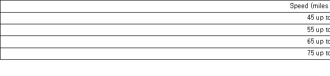 When using a polygon to graph quantitative data,what does each point represent?
A) The lower limit of a particular class and its width
B) The midpoint of a particular class and its associated frequency or relative frequency
C) The midpoint of a particular class and its associated cumulative frequency or cumulative relative frequency
D) The upper limit of a particular class and its associated cumulative frequency or cumulative relative frequency
Correct Answer:

Verified
Correct Answer:
Verified
Q5: The following histogram represents the number of
Q6: The accompanying cumulative relative frequency distribution shows
Q7: The following stem-and-leaf diagram shows the last
Q9: What type of relationship is indicated in
Q11: The following table lists some of the
Q12: The following is a list of five
Q15: A car dealership created a scatterplot showing
Q18: For both qualitative and quantitative data, what
Q75: A stem-and-leaf diagram is useful in that
Q108: For qualitative data, a frequency distribution groups