Multiple Choice
The graph below is a plot of the fuel efficiency (in miles per gallon,or mpg) of various cars versus the weight of these cars (in thousands of pounds) . 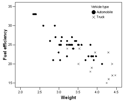 The points denoted by the plotting symbol × correspond to pick-up trucks and SUVs.The points denoted by the plotting symbol correspond to automobiles (sedans and station wagons) .What can we conclude from this plot?
A) There is little difference between trucks and automobiles.
B) Trucks tend to be higher in weight than automobiles.
C) Trucks tend to get poorer gas mileage than automobiles.
D) The plot is invalid.A scatterplot is used to represent quantitative variables,and the vehicle type is a qualitative variable.
E) Both B and C
Correct Answer:

Verified
Correct Answer:
Verified
Q23: A researcher measured the height (in feet)and
Q24: When examining a scatterplot for strength,you are
Q25: Malaria is a leading cause of infectious
Q26: Explanatory variables are also called _ variables.
Q27: Time plots are special scatterplots where the
Q29: When examining a scatterplot for form,you are
Q30: You can describe the overall pattern of
Q31: Fill in the blank.The owner of a
Q32: The scatterplot below displays data collected from
Q33: Which of the following statements about a