Exam 4: Describing Data: Displaying and Exploring Data
Exam 1: What Is Statistics79 Questions
Exam 2: Describing Data: Frequency Distributions and Graphic Presentations81 Questions
Exam 3: Describing Data: Numerical Measures115 Questions
Exam 4: Describing Data: Displaying and Exploring Data85 Questions
Exam 5: A Survey of Probability Concepts106 Questions
Exam 6: Discrete Probability Distributions94 Questions
Exam 7: Continuous Probability Distributions90 Questions
Exam 8: Sampling Methods and the Central Limit Theorem92 Questions
Exam 9: Estimation and Confidence Intervals94 Questions
Exam 10: One-Sample Tests of Hypothesis140 Questions
Exam 11: Two-Sample Tests of Hypothesis77 Questions
Exam 12: Analysis of Variance94 Questions
Exam 13: Linear Regression and Correlation135 Questions
Exam 14: Multiple Regression and Correlation Analysis125 Questions
Exam 15: Chi-Square Applications101 Questions
Select questions type
A dot plot is an easy way to represent the relationship between two variables.
(True/False)
4.7/5  (38)
(38)
A telemarketing firm is monitoring the performance of its employees based on the number of sales per hour.One employee had the following sales for the last 20 hours. 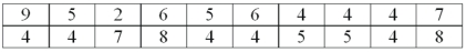 For the distribution of number of sales per hour,50% of the observations are between __________ and _________.
(Short Answer)
5.0/5 (37)
In a symmetric distribution,where is the 99th percentile located? _______________
(Short Answer)
4.9/5 (28)
What is the difference between a scatter diagram and a contingency table?
(Essay)
4.7/5 (43)
A student scored in the 85th percentile on a standardized test.This means that the student scored lower than 85% of all students who took the test.
(True/False)
4.7/5 (30)
A student scored in the 65th percentile on a standardized test.This means that the student scored higher than 65% of all students who took the test.
(True/False)
4.8/5 (30)
Negatively skewed indicates that a distribution is not symmetrical.The long tail is to the left.
(True/False)
4.7/5 (36)
In a negatively skewed distribution,the mean is smaller than the median or mode and the mode occurs at the peak of the curve.
(True/False)
4.8/5 (29)
The interquartile range is the difference between the values of the first and third quartile,indicating the range of the middle fifty percent of the observations.
(True/False)
4.9/5 (32)
A relationship between gender and preference for Coke or Pepsi can be best represented by a contingency table.
(True/False)
4.8/5 (32)
A scatter diagram is useful for quickly graphing frequencies in a small data set.
(True/False)
4.8/5 (32)
The test scores for a class of 147 students are computed.What is the location of the test score associated with the third quartile?
(Multiple Choice)
4.9/5 (32)
A dot plot and a scatter diagram are different names for the same graph.
(True/False)
4.7/5 (31)
Quartiles are another way to describe the dispersion of a distribution.
(True/False)
4.9/5 (37)
A box plot shows the range of values that correspond to the upper 25% of the distribution.
(True/False)
4.8/5 (32)
Filters
- Essay(0)
- Multiple Choice(0)
- Short Answer(0)
- True False(0)
- Matching(0)