Exam 2: Describing Data: Frequency Distributions and Graphic Presentations
Exam 1: What Is Statistics79 Questions
Exam 2: Describing Data: Frequency Distributions and Graphic Presentations81 Questions
Exam 3: Describing Data: Numerical Measures115 Questions
Exam 4: Describing Data: Displaying and Exploring Data85 Questions
Exam 5: A Survey of Probability Concepts106 Questions
Exam 6: Discrete Probability Distributions94 Questions
Exam 7: Continuous Probability Distributions90 Questions
Exam 8: Sampling Methods and the Central Limit Theorem92 Questions
Exam 9: Estimation and Confidence Intervals94 Questions
Exam 10: One-Sample Tests of Hypothesis140 Questions
Exam 11: Two-Sample Tests of Hypothesis77 Questions
Exam 12: Analysis of Variance94 Questions
Exam 13: Linear Regression and Correlation135 Questions
Exam 14: Multiple Regression and Correlation Analysis125 Questions
Exam 15: Chi-Square Applications101 Questions
Select questions type
A pie chart shows the number of observations in each class.
Free
(True/False)
4.9/5  (29)
(29)
Correct Answer: Verified
False
When a class interval is expressed as: 100 up to 200,
Free
(Multiple Choice)
4.9/5 (38)
Correct Answer:Verified
C
To convert a frequency distribution to a relative frequency distribution,divide each class frequency by the number of classes.
Free
(True/False)
4.9/5 (31)
Correct Answer:Verified
False
In constructing a frequency polygon,class frequencies are scaled on which axis? ______
(Short Answer)
4.9/5 (39)
A frequency polygon is a very useful graphic technique when comparing two or more distributions.
(True/False)
4.9/5 (42)
Refer to the following frequency distribution on days absent during a calendar year by employees of a manufacturing company: 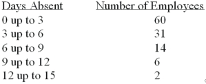 How many employees were absent between 3 up to 6 days?
(Multiple Choice)
4.8/5 (42)
When data is collected using a qualitative,nominal variable,what is true about a frequency distribution that summarizes the data?
(Multiple Choice)
4.9/5 (33)
A student was interested in the cigarette smoking habits of college students and collected data from an unbiased random sample of students.The data is summarized in the following table: 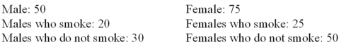 Why is the table NOT a frequency distribution?
(Multiple Choice)
4.9/5 (36)
A class interval,which is the width of a class,can be determined by subtracting the lower limit of a class from the lower limit of the next higher class.
(True/False)
4.9/5 (36)
In a frequency distribution,the number of observations in a class is called class
(Multiple Choice)
4.8/5 (31)
Refer to the following distribution of commissions: 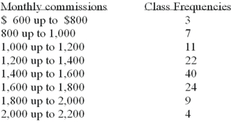 For the distribution above,what is the midpoint of the class with the greatest frequency?
(Multiple Choice)
4.9/5 (38)
In constructing a frequency distribution,you should try to have open-ended classes such as "Under $100" and "$1,000 and over".
(True/False)
4.9/5 (35)
What is the number of observations in each class of a frequency distribution called?__________________________
(Short Answer)
4.9/5 (46)
Refer to the following distribution:  What are the class limits for class with the highest frequency?
(Multiple Choice)
4.8/5 (36)
A group of 100 students were surveyed about their interest in a new International Studies program.Interest was measured in terms of high,medium,or low.30 students responded high interest;40 students responded medium interest;30 students responded low interest.What is the relative frequency of students with high interest?
(Multiple Choice)
4.7/5 (35)
When classes in a frequency table are constructed so that each observation will fit into only one class,the categories are ________________________.
(Short Answer)
5.0/5 (37)
The age distribution of a sample of part-time employees at Lloyd's Fast Food Emporium is: 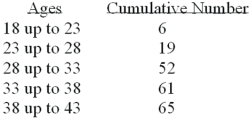 What type of chart should be drawn to present this data?
(Multiple Choice)
4.7/5 (30)
Filters
- Essay(0)
- Multiple Choice(0)
- Short Answer(0)
- True False(0)
- Matching(0)