Exam 3: Graphical Descriptive Techniques Nominal Data
Exam 1: What Is Statistics17 Questions
Exam 2: Types of Data, Data Collection and Sampling18 Questions
Exam 3: Graphical Descriptive Techniques Nominal Data17 Questions
Exam 4: Graphical Descriptive Techniques Numerical Data65 Questions
Exam 5: Numerical Descriptive Measures149 Questions
Exam 6: Probability113 Questions
Exam 7: Random Variables and Discrete Probability Distributions50 Questions
Exam 8: Continuous Probability Distributions113 Questions
Exam 9: Statistical Inference and Sampling Distributions69 Questions
Exam 10: Estimation: Describing a Single Population125 Questions
Exam 11: Estimation: Comparing Two Populations36 Questions
Exam 12: Hypothesis Testing: Describing a Single Population124 Questions
Exam 13: Hypothesis Testing: Comparing Two Populations69 Questions
Exam 14: Additional Tests for Nominal Data: Chi-Squared Tests113 Questions
Exam 15: Simple Linear Regression and Correlation213 Questions
Exam 16: Multiple Regression122 Questions
Exam 17: Time-Series Analysis and Forecasting147 Questions
Exam 18: Index Numbers27 Questions
Select questions type
Which of the following best describes a bar chart?
Free
(Multiple Choice)
4.8/5  (27)
(27)
Correct Answer: Verified
A
A bar chart is a graphical display of a nominal (categorical) variable. The reason for the gaps between the bars is to emphasise that the bars can be placed in any order as the variable is categorical.
Free
(True/False)
4.7/5 (39)
Correct Answer:Verified
True
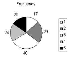
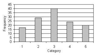
Given the following five categories and the number of times each occurs, construct a pie chart and a bar chart. Category 1 2 3 4 5 Frequency 17 29 40 24 20
Free
(Essay)
4.8/5 (35)
Correct Answer:Verified
Car buyers were asked by a car dealer to rate their level of satisfaction with the service they had
received. The four ratings were Excellent (E), Good (G), Satisfactory (S) and Unsatisfactory (U). The
following data were obtained.
a. Create a bar chart of the level of satisfaction with the service.
b. Create a pie chart of the level of satisfaction with the service.
(Essay)
4.8/5 (35)
Voters participating in a recent election exit poll in a Queensland electorate were asked to state their political party affiliation as well as their gender. Coding the data 1 for Coalition, 2 for minor parties and 3 for Labor, and F for female, M for male. 3 1 2 3 1 3 3 2 1 3 3 2 1 1 3 2 3 1 3 2 3 2 1 1 3 a. Create a cross classification table of gender by political affiliation.
b. Create a component bar chart, for each gender.
c. Interpret your component bar chart by gender.
(Essay)
5.0/5 (35)
If the focus is to compare the size or frequency of various categories, a bar chart may be appropriate. Pie charts are effective whenever the objective is to display the components of a whole entity in a manner that indicates their relative sizes.
(True/False)
5.0/5 (29)
Which of the following statements about pie charts is false?
(Multiple Choice)
4.9/5 (43)
Construct a pie chart for the sample of 200 business school graduates is shown in the following table. Major of graduates Number of graduates Accounting 58 Finance 42 Management 38 Marketing 52 Other 10
(Essay)
4.9/5 (34)
Voters participating in a recent election exit poll in a Queensland electorate were asked to state their political party affiliation. Coding the data 1 for Coalition, 2 for minor parties and 3 for Labor, the data collected were as follows: 3 1 2 3 1 3 3 2 1 3 3 2 1 1 3 2 3 1 3 2 3 2 1 1 3 Create a bar chart to display the political party affiliation in the Queensland electorate. Write a short sentence to describe the political affiliation.
(Essay)
4.7/5 (41)
Identify the type of data for which each of the following graphs is appropriate.
a. Pie chart.
b. Bar chart.
(Essay)
4.8/5 (35)
Which of the following is a graphical technique used to present nominal (categorical) data?
(Multiple Choice)
5.0/5 (36)
The wedges of a pie chart, if displayed as proportions, will sum to 1 or 100%.
(True/False)
4.8/5 (38)
A pie chart is always preferable to a bar chart, when describing a nominal variable.
(True/False)
4.8/5 (40)
When a comparison of two breakdowns is desired, component bar charts offer a good alternative to using two pie charts.
(True/False)
4.8/5 (43)
Which of the following best describes a component bar chart?
(Multiple Choice)
4.8/5 (40)
Filters
- Essay(0)
- Multiple Choice(0)
- Short Answer(0)
- True False(0)
- Matching(0)