Exam 4: Graphical Descriptive Techniques Numerical Data
Exam 1: What Is Statistics17 Questions
Exam 2: Types of Data, Data Collection and Sampling18 Questions
Exam 3: Graphical Descriptive Techniques Nominal Data17 Questions
Exam 4: Graphical Descriptive Techniques Numerical Data65 Questions
Exam 5: Numerical Descriptive Measures149 Questions
Exam 6: Probability113 Questions
Exam 7: Random Variables and Discrete Probability Distributions50 Questions
Exam 8: Continuous Probability Distributions113 Questions
Exam 9: Statistical Inference and Sampling Distributions69 Questions
Exam 10: Estimation: Describing a Single Population125 Questions
Exam 11: Estimation: Comparing Two Populations36 Questions
Exam 12: Hypothesis Testing: Describing a Single Population124 Questions
Exam 13: Hypothesis Testing: Comparing Two Populations69 Questions
Exam 14: Additional Tests for Nominal Data: Chi-Squared Tests113 Questions
Exam 15: Simple Linear Regression and Correlation213 Questions
Exam 16: Multiple Regression122 Questions
Exam 17: Time-Series Analysis and Forecasting147 Questions
Exam 18: Index Numbers27 Questions
Select questions type
For a bar chart to show graphical excellence, the bars must be the same width irrespective of each bar's height.
Free
(True/False)
4.8/5  (39)
(39)
Correct Answer: Verified
True
The modal class (classes) of a frequency distribution is the class (are the classes) with the highest frequency.
Free
(True/False)
4.8/5 (20)
Correct Answer:Verified
True
The following data are test grades for a university business statistics class. 63 74 42 65 51 54 36 56 68 57 62 64 76 67 79 61 81 77 59 38 84 68 71 94 71 86 69 75 91 55 48 82 83 54 79 62 68 58 41 47 a. Construct a cumulative frequency distribution and a cumulative relative frequency distribution for the data.
b. What proportion of the grades is less than 60?
c. What proportion of the grades is more than 70?
Free
(Essay)
4.7/5 (33)
Correct Answer:Verified
a. b. 0.350.
c. 1 - 0.625 = 0.375.
The strength of a linear relationship between two numerical variables may be illustrated by a line graph, where the closer the points form a line, the stronger the linear relationship between the two variables.
(True/False)
4.7/5 (36)
In any relative frequency distribution, the sum of all the relative frequencies is always equal to 1.
(True/False)
4.8/5 (38)
A list of share prices of one Australian company, at the end of a trading day for the period of 30 trading days, would be an example of time-series data.
(True/False)
4.8/5 (31)
Individual observations within each class may be found in a frequency distribution.
(True/False)
4.8/5 (38)
Construct a relative frequency histogram for the test grades for a university business statistics class. 63 74 42 65 51 54 36 56 68 57 62 64 76 67 79 61 81 77 59 38 84 68 71 94 71 86 69 75 91 55 48 82 83 54 79 62 68 58 41 47
(Essay)
4.9/5 (46)
The table below shows the number of licensed hotels with at least 15 rooms in New South Wales from March 2005 to June 2015. Quarter- Year Number Quarter- vear Number Mar-2005 199 Jun-2010 209 Jun-2005 199 Sep-2010 207 Sep-2005 198 Dec-2010 206 Dec-2005 199 Mar-2011 207 Mar-2006 202 Juп-2011 205 Jun-2006 205 Sep-2011 206 Sep-2006 203 Dec-2011 205 Dec-2006 201 Mar-2012 209 Mar-2007 202 Jun-2012 205 Jun-2007 200 Sep-2012 207 Sep-2007 202 Dec-2012 207 Dec-2007 202 Mar-2013 209 Mar-2008 201 Jun-2013 209 Jun-2008 203 Sep-2013 208 Sep-2008 204 Dec-2013 208 Dec-2008 203 Mar-2014 208 Mar-2009 203 Jun-2014 208 Jun-2009 206 Sep-2014 241 Sep-2009 203 Dec-2014 244 Dec-2009 210 Mar-2015 244 Mar-2010 208 Jun-2015 243 a. Plot the time series.
b. When did the number of licensed hotels with at least 15 rooms in New South Wales grow fastest?
(Essay)
4.9/5 (30)
The weights in kilograms of a sample of 30 horses are given below: Weight
165 175 150 155 173 149 145 153 153 153 152 145 164 143 170 175 148 174 171 156 166 168 152 150 173 168 146 155 172 159 a. Construct a cumulative relative frequency distribution for the data.
b. Construct an ogive for the data.
c. What proportion of horses weighs less than 160kgs?
d. What proportion of horses weighs between 145 and 165kgs?
(Essay)
4.9/5 (35)
A scatter diagram which has points widely dispersed, where no clear line is visible, indicates no linear relationship between the variables.
(True/False)
4.8/5 (38)
Construct a cumulative relative frequency distribution for the number of years of service for 100 employees, given the frequency distribution of the number of years of service for 100 employees is shown below. Years Frequency 0 up to 5 12 5 up to 10 16 10 up to 15 42 15 up to 20 20 20 up to 25 10 Total 100
(Essay)
4.9/5 (33)
The stem-and-leaf display reveals far more information about individual values than does the histogram.
(True/False)
4.9/5 (29)
A relative frequency distribution describes the number of data values that fall within each class, and may be presented in histogram form.
(True/False)
4.9/5 (31)
A stem-and-leaf display describes two-digit integers between 20 and 70. For one of the classes displayed, the row appears as 4 | 2 5 6. The numerical values being described are 42, 45 and 46.
(True/False)
4.8/5 (40)
The bar chart below is of the colour of motor vehicles in a random sample. A student commented that the distribution was negatively skewed. Explain what is wrong with this statement.
Relative Frequency: Motor Vehicle Colour 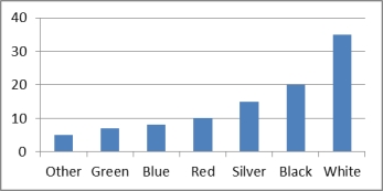
(Essay)
4.8/5 (43)
A frequency distribution shows the number of data values falling within each class.
(True/False)
4.7/5 (36)
Which of the following is the best type of chart for illustrating the GDP of Australia from 1960 to 2010?
(Multiple Choice)
4.7/5 (29)
Filters
- Essay(0)
- Multiple Choice(0)
- Short Answer(0)
- True False(0)
- Matching(0)