 Chat with AI
Exam 9: Implementing Responsive Design
Exam 1: Getting Started With Html67 Questions
Exam 2: Structuring Content in a Web Document71 Questions
Exam 3: Getting Started With Css71 Questions
Exam 4: Laying Out Elements With Css71 Questions
Exam 5: Formatting Text With Css71 Questions
Exam 6: Inserting and Working With Links70 Questions
Exam 7: Inserting and Working With Images71 Questions
Exam 8: Organizing Content With Lists and Tables70 Questions
Exam 9: Implementing Responsive Design71 Questions
Exam 10: Creating and Processing Web Forms71 Questions
Exam 11: Creating Visual Effects and Animation71 Questions
Exam 12: Incorporating Video and Audio71 Questions
Exam 13: Programming Web Pages With Javascript71 Questions
Exam 14: Integrating Social Media72 Questions
Exam 15: Optimizing Your Web Site for Search Engines71 Questions
Exam 16: Testing and Improving Performance71 Questions
Select questions type
Responsive design allows a web developer to specify different HTML code for some or all of a page's elements._________________________
(True/False)
4.9/5  (36)
(36)
(36) Which pseudo-class selects the first child element of the specified type?
(Multiple Choice)
4.8/5 (44)
(44) Element widths in responsive designs are often specified in pixels ._________________________
(True/False)
4.7/5 (38)
(38) An example of progressive enhancement is when you specify a fallback color for a background image. _________________________
(True/False)
4.8/5 (37)
(37) 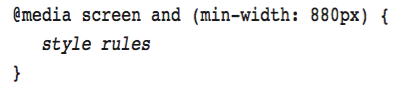 Referring to the figure above, the word and represents a
When your default layout is optimized for small screens, then the media query for your first breakpoint would use the __________ media feature.
(Multiple Choice)
4.9/5 (34)
(34) Before making a website publicly available, it's important to test it on as many devices that your audience may be using as possible.
(True/False)
4.8/5 (37)
(37) Case-Based Critical Thinking Question
Tracy is using responsive design to build a website featuring images and descriptions of national parks.
Tracy implements responsive navigation by adding a(n) __________ to the layout to represent the nav bar.
(Multiple Choice)
4.8/5 (32)
(32) A media query recreates a feature for older browsers using JavaScript code. _________________________
(True/False)
4.7/5 (45)
(45) Case-Based Critical Thinking Question
Tracy is using responsive design to build a website featuring images and descriptions of national parks.
Tracy shortens the descriptions of the parks when the site is displayed on smaller screens; this is an implementation of __________.
(Multiple Choice)
4.8/5 (33)
(33) Which of the following is a commonly hidden web page element?
(Multiple Choice)
5.0/5 (29)
(29) In general, you use the min-width media feature for all media queries when your starting layout is optimized for a small screen. _________________________
(True/False)
4.8/5 (39)
(39) Limiting the amount of content shown by default and making related information available if a user requests it is sometimes called responsive content. _________________________
(True/False)
4.8/5 (37)
(37) On smaller screens, it's standard to replace the nav bar with a button showing 3 horizontal lines.
(True/False)
4.8/5 (35)
(35) 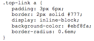 Referring to the figure above, the code that creates rounded corners starts with __________.
Referring to the figure above, the code that creates rounded corners starts with __________. (Multiple Choice)
4.8/5 (39)
(39) To create a web page using responsive design, you start by creating a layout that's optimized for
(Multiple Choice)
4.7/5 (36)
(36) 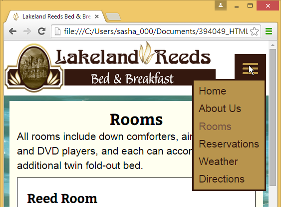 Referring to the figure above, which aspect of responsive design does the figure illustrate?
Referring to the figure above, which aspect of responsive design does the figure illustrate? (Multiple Choice)
4.8/5 (36)
(36) If you placed two images side by side and assigned each a width of 45%, how much room would be left for the margin, padding, and border?
(Multiple Choice)
4.9/5 (42)
(42) When creating a responsive design, you create a(n) __________ at a width where the layout no longer looks good, or where you'd like to move elements or add or remove content.
(Multiple Choice)
4.9/5 (42)
(42) 
Filters
- Essay(0)
- Multiple Choice(0)
- Short Answer(0)
- True False(0)
- Matching(0)