 Chat with AI
Exam 9: Implementing Responsive Design
Exam 1: Getting Started With Html67 Questions
Exam 2: Structuring Content in a Web Document71 Questions
Exam 3: Getting Started With Css71 Questions
Exam 4: Laying Out Elements With Css71 Questions
Exam 5: Formatting Text With Css71 Questions
Exam 6: Inserting and Working With Links70 Questions
Exam 7: Inserting and Working With Images71 Questions
Exam 8: Organizing Content With Lists and Tables70 Questions
Exam 9: Implementing Responsive Design71 Questions
Exam 10: Creating and Processing Web Forms71 Questions
Exam 11: Creating Visual Effects and Animation71 Questions
Exam 12: Incorporating Video and Audio71 Questions
Exam 13: Programming Web Pages With Javascript71 Questions
Exam 14: Integrating Social Media72 Questions
Exam 15: Optimizing Your Web Site for Search Engines71 Questions
Exam 16: Testing and Improving Performance71 Questions
Select questions type
To create a web page using responsive design, you start by creating a layout that's optimized for both the smallest and the largest screen size you want to support.
(True/False)
4.9/5  (39)
(39)
(39) One method of implementing adaptive content is to change the display of elements in media queries using class names.
(True/False)
4.8/5 (37)
(37) In a media query for responsive design, you follow the media type with one or more media __________, which specify conditions that the media must satisfy for the rules in the media query to be applied..
(Multiple Choice)
5.0/5 (38)
(38) Case-Based Critical Thinking Question
Tracy is using responsive design to build a website featuring images and descriptions of national parks.
Tracy wants to change the display of the first child of another element; to do so, he uses __________.
(Multiple Choice)
4.8/5 (43)
(43) The practice of limiting the amount of content shown by default and making related information available only if a user requests is is known as __________ content.
(Short Answer)
4.7/5 (34)
(34) __________ allows a web developer to specify different CSS style rules for some or all of a page's elements depending on the width of the screen or browser window.
(Short Answer)
4.9/5 (35)
(35) A(n) __________ recreates a recently added CSS property for older browsers using JavaScript code.
(Short Answer)
4.9/5 (40)
(40) Before making a website publicly available, it's important to test on
(Multiple Choice)
4.8/5 (34)
(34) A media __________ specifies conditions that specific media must satisfy for the rules in a media query to be applied.
(Short Answer)
4.9/5 (37)
(37) One of the most commonly hidden web page elements for smaller screens is the nav bar._________________________
(True/False)
4.9/5 (38)
(38)  Referring to the figure above, the word screen represents a
Referring to the figure above, the word screen represents a (Multiple Choice)
4.8/5 (36)
(36) You use the @media keyword to create a media query for responsive design using which media type?
(Multiple Choice)
4.9/5 (35)
(35) Which of the following recreates a CSS feature for older browsers using JavaScript code?
(Multiple Choice)
4.8/5 (30)
(30) 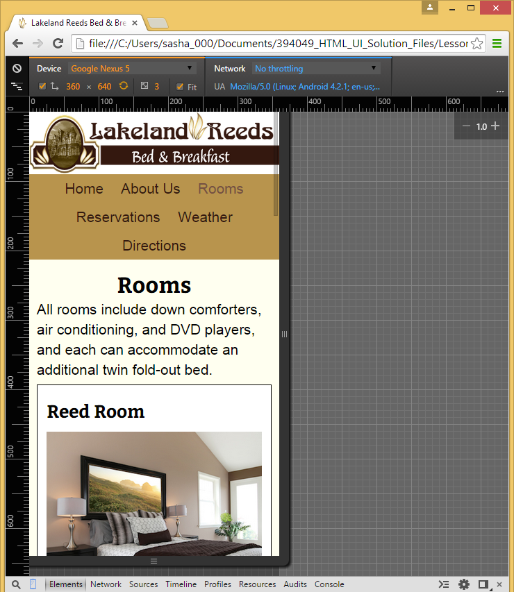 Referring to the figure above, which of the following aspects of responsive design does the figure show?
Referring to the figure above, which of the following aspects of responsive design does the figure show? (Multiple Choice)
4.9/5 (32)
(32) At a certain width-known as a(n) __________ - a layout no longer looks good, or you may decide that you'd like to move elements or add or remove content to accommodate that window size.
(Short Answer)
4.8/5 (32)
(32)  Referring to the figure above, the word min-width represents a
Referring to the figure above, the word min-width represents a (Multiple Choice)
4.8/5 (43)
(43) Instead of testing on actual mobile devices, you can use an application known as a(n) emulator ._________________________
(True/False)
4.9/5 (42)
(42) Responsive design allows you to specify different CSS style rules depending on
(Multiple Choice)
5.0/5 (44)
(44) You should never limit the amount of content shown by default on a smaller screen.
(True/False)
4.8/5 (39)
(39) 
Filters
- Essay(0)
- Multiple Choice(0)
- Short Answer(0)
- True False(0)
- Matching(0)