 Chat with AI
Exam 6: Creating a Form on a Web
Exam 1: Introduction to the Internet and Web Design103 Questions
Exam 2: Building a Webpage Template With Html590 Questions
Exam 3: Enhancing a Website With Links and Images95 Questions
Exam 4: Applying Css Styles to Webpages101 Questions
Exam 5: Responsive Design: Designing for Mobile Devices103 Questions
Exam 6: Creating a Form on a Web91 Questions
Exam 7: Improving Web Design With New Page Layouts81 Questions
Exam 8: Creating Tables and Forms83 Questions
Exam 9: Integrating Audio and Video85 Questions
Exam 10: Creating Interactivity With Social Media and Javascript79 Questions
Exam 11: Publish and Promote a Website78 Questions
Exam 12: Maintaining a Website83 Questions
Exam 13: Appendix: Html Special Feature 1 Attracting Visitors to Your Web Site29 Questions
Select questions type
_____ is an effective troubleshooting tool during the development process and adds a valuable level of professionalism to one's work.
(Multiple Choice)
4.8/5  (38)
(38)
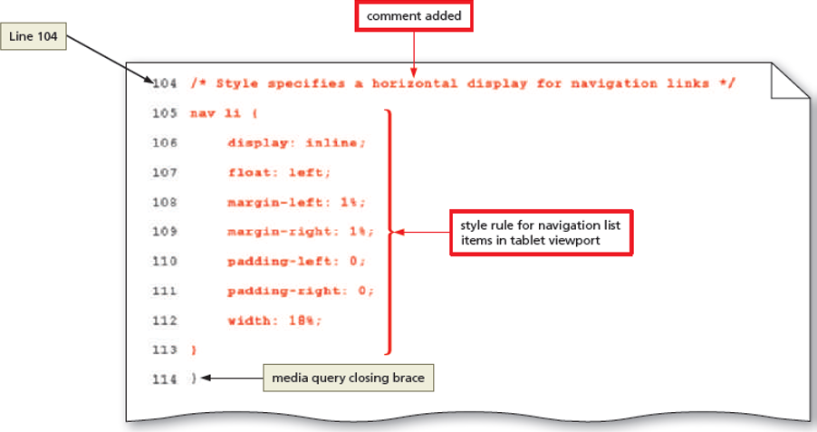
(38)  Which of the following properties, from the figure, improves the appearance of navigation links by placing each list item immediately after the previous list item?
Which of the following properties, from the figure, improves the appearance of navigation links by placing each list item immediately after the previous list item? (Multiple Choice)
4.8/5 (30)
(30) The only thing that should change while designing a tablet viewport is the appearance of the website.
(True/False)
4.8/5 (36)
(36) Which of the following pseudo-classes is used to style a link that is clicked at the moment?
(Multiple Choice)
4.9/5 (41)
(41) When testng for minimum and maximum widths, the word "and" separates each part of the media attribute value.
(True/False)
4.9/5 (32)
(32) To create a radial gradient, at least two colors must be specified.
(True/False)
5.0/5 (35)
(35) The selector _____ identifies the color to apply to a navigation link when the link is being clicked or when it gains focus.
(Multiple Choice)
4.9/5 (42)
(42) Kevin, a manager at FitPlus fitness club, owns a website that updates information regarding his fitness club. He had created background gradients by tiling gradient images across a page or element. Now, he wishes to remove these and add gradients supported by Cascading Style Sheet (CSS) 3. Kevin wants to apply a gradient that transitions from blue for the top portion of the page to white for the bottom portion of the page. Which of the following properties should he use?
(Multiple Choice)
5.0/5 (35)
(35) The _____ attribute is used to determine which stylesheet should be applied.
(Multiple Choice)
4.8/5 (41)
(41) Identify the maximum viewport width for tablets and larger smartphones.
(Multiple Choice)
4.9/5 (44)
(44) Identify the letter of the choice that best matches the phrase or definition.
Correct Answer: Verified
VerifiedPremises:
Responses:
(Matching)
4.7/5 (29)
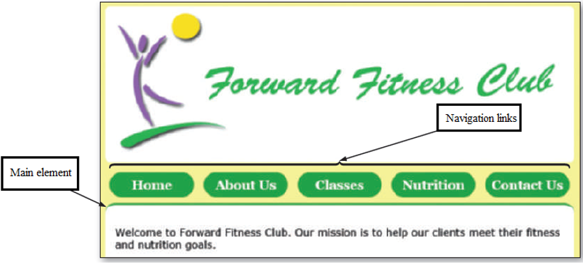
(29)  Which of the following properties and values should be used if the navigation links should appear within the main area of a website?
Which of the following properties and values should be used if the navigation links should appear within the main area of a website? (Multiple Choice)
4.9/5 (42)
(42) Since desktop screens are often wider than those for other devices, designing for a desktop viewport can only use single-column layout.
(True/False)
4.8/5 (36)
(36) In the media query @media only screen , the keyword only indicates _____.
(Multiple Choice)
4.9/5 (36)
(36) 
Filters
- Essay(0)
- Multiple Choice(0)
- Short Answer(0)
- True False(0)
- Matching(0)