 Chat with AI
Exam 6: Creating a Form on a Web
Exam 1: Introduction to the Internet and Web Design103 Questions
Exam 2: Building a Webpage Template With Html590 Questions
Exam 3: Enhancing a Website With Links and Images95 Questions
Exam 4: Applying Css Styles to Webpages101 Questions
Exam 5: Responsive Design: Designing for Mobile Devices103 Questions
Exam 6: Creating a Form on a Web91 Questions
Exam 7: Improving Web Design With New Page Layouts81 Questions
Exam 8: Creating Tables and Forms83 Questions
Exam 9: Integrating Audio and Video85 Questions
Exam 10: Creating Interactivity With Social Media and Javascript79 Questions
Exam 11: Publish and Promote a Website78 Questions
Exam 12: Maintaining a Website83 Questions
Exam 13: Appendix: Html Special Feature 1 Attracting Visitors to Your Web Site29 Questions
Select questions type
Which of the following layouts is used by the mobile-first approach to prevent horizontal scrolling and minimize vertical scrolling?
(Multiple Choice)
4.9/5  (34)
(34)
(34) 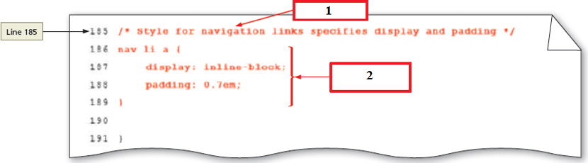 In the above program, box 2 indicates the style rule for _____.
In the above program, box 2 indicates the style rule for _____. (Multiple Choice)
4.8/5 (43)
(43) Identify the purpose of the white-space property with a nowrap value.
(Multiple Choice)
4.8/5 (34)
(34) A(n) _________ detects the media type and the capabilities of the device that the browser is running on.
(Short Answer)
4.7/5 (26)
(26) The logical expressions to media queries in an external Cascading Style Sheet (CSS) file are as follows: @media screen and (min-width: 481px) {
.mobile { display: none; }
}
In this case, _____ is the feature of the screen that is tested.
(Multiple Choice)
4.8/5 (37)
(37) Samantha is an entrepreneur and her company website has the following links: Home, About Us, Careers, Contact Us. She wishes to vary their appearance whenever they are visited or clicked. Samantha wants the color of Home to turn yellow when she moves the pointer over it. Identify the pseudo-class that should be used to perform this function.
(Multiple Choice)
4.8/5 (36)
(36) Which of the following is the minimum viewport width for large desktop monitors?
(Multiple Choice)
4.9/5 (40)
(40) A breakpoint is where different styles are applied to a webpage to cause it to change in a way that makes it easier to read and navigate for a particular situation.
(True/False)
4.9/5 (37)
(37) If a particular tablet device has a viewport smaller than the minimum size specified in a media query, the layout will default to the mobile viewport layout.
(True/False)
4.8/5 (35)
(35) Which of the following is part of a pseudo-class and is placed between a selector and the pseudo-class?
(Multiple Choice)
4.8/5 (41)
(41) 
Filters
- Essay(0)
- Multiple Choice(0)
- Short Answer(0)
- True False(0)
- Matching(0)