Exam 2: Summarizing Data: Frequency Distributions in Tables and Graphs
Exam 1: Introduction to Statistics80 Questions
Exam 2: Summarizing Data: Frequency Distributions in Tables and Graphs80 Questions
Exam 3: Summarizing Data: Central Tendency80 Questions
Exam 4: Summarizing Data: Variability80 Questions
Exam 5: Probability80 Questions
Exam 6: Probability, normal Distributions, and Z Scores80 Questions
Exam 7: Probability and Sampling Distributions80 Questions
Exam 8: Hypothesis Testing: Significance,effect Size,and Power80 Questions
Exam 9: Testing Means: One-Sample and Two-Independent-Sample T Tests80 Questions
Exam 10: Testing Means: Truehe Related-Samples T Test80 Questions
Exam 11: Estimation and Confidence Intervals60 Questions
Exam 12: Analysis of Variance: One-Way Between-Subjects Design80 Questions
Exam 13: Analysis of Variance: One-Way Within-Subjects Repeated-Measuresdesign80 Questions
Exam 14: Analysis of Variance: Two-Way Between-Subjects Factorial Design80 Questions
Exam 15: Correlation80 Questions
Exam 16: Linear Regression and Multiple Regression80 Questions
Exam 17: Nonparametric Tests: Chi-Square Tests80 Questions
Exam 18: Nonparametric Tests: Tests for Ordinal Data60 Questions
Select questions type
A researcher measures the time (in seconds)it takes children to complete a basic reading skills task.What type of graphical display would be most appropriate for summarizing the frequency of children falling into different intervals of time?
Free
(Multiple Choice)
4.9/5  (34)
(34)
Correct Answer: Verified
A
The data should be grouped for the following data set: 0,0,0,2,2,1,1,2,2,2,1,0,0,0,0,2,2,1,1,1,2,1,2,2,0,0,1,and 2.
Free
(True/False)
5.0/5 (27)
Correct Answer:Verified
False
The real range is the difference between the largest value and the smallest value in a data set.
Free
(True/False)
4.7/5 (33)
Correct Answer:Verified
False
Which of the following requires the calculation of a real range?
(Multiple Choice)
4.8/5 (31)
The midpoint of a given interval is the average of the upper and lower boundaries for that interval.
(True/False)
4.9/5 (34)
The corresponding percentile of a given percentile point is the percentile rank of that score.
(True/False)
4.9/5 (42)
A graphical display for grouped frequency distributions with continuous data is called a
(Multiple Choice)
4.9/5 (36)
Summarizing data in a table or graph can make it easier to see patterns in the data.
(True/False)
4.7/5 (38)
The three steps for constructing a simple frequency distribution are
(Multiple Choice)
4.7/5 (25)
To determine the interval width,we divide the ______ by the number of intervals.
(Multiple Choice)
4.8/5 (35)
What is the percentile point at the 90th percentile in the following distribution?

(Multiple Choice)
4.8/5 (34)
When cumulating frequencies from the bottom up,the data are discussed in terms of
(Multiple Choice)
4.8/5 (33)
Fill in the missing values for A and B in this frequency distribution table:

(Multiple Choice)
5.0/5 (26)
State the type of graphical display for Graph A and GraphB. 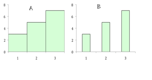
(Multiple Choice)
4.9/5 (40)
Twelve percent of students scored at or below a failing grade on an exam.A percentile rank distribution would be appropriate to summarize this outcome.
(True/False)
4.8/5 (33)
Which of the following is a type of graphical display used to summarize quantitative,continuous data?
(Multiple Choice)
4.9/5 (25)
The following is a simple frequency distribution table.Suppose we convert this table to a cumulative frequency distribution.The frequencies in each interval of the cumulative frequency distribution would be

(Multiple Choice)
4.9/5 (23)
A psychologist wants to know how many of her clients continue with therapy for at least 12 days.If she constructs a frequency distribution for these data,what type of distribution would be most appropriate to answer her question?
(Multiple Choice)
4.8/5 (39)
A student scores in the 80th percentile on an exam.What does this mean in comparison to all other students?
(Multiple Choice)
4.8/5 (41)
To summarize relative percent data,a pie chart can be a good choice to display the data.
(True/False)
4.8/5 (33)
Filters
- Essay(0)
- Multiple Choice(0)
- Short Answer(0)
- True False(0)
- Matching(0)