 Chat with AI
Exam 9: Implementing Responsive Design
Exam 1: Getting Started With HTML75 Questions
Exam 2: Structuring Content in a Web Document75 Questions
Exam 3: Getting Started With CSS71 Questions
Exam 4: Laying Out Elements With CSS75 Questions
Exam 5: Formatting Text With CSS75 Questions
Exam 6: Inserting and Working With Links74 Questions
Exam 7: Inserting and Working With Images74 Questions
Exam 8: Organizing Content With-Lists And-Tables75 Questions
Exam 9: Implementing Responsive Design74 Questions
Exam 10: Creating and Processing Web Forms75 Questions
Exam 11: Creating Visual Effects and Animation75 Questions
Exam 12: Incorporating Video and Audio74 Questions
Exam 13: Programming Web Pages With Javascript75 Questions
Exam 14: Integrating Social Media75 Questions
Exam 15: Optimizing Your Web Site for Search Engines75 Questions
Exam 16: Testing and Improving Performance70 Questions
Select questions type
In many layouts, you want to specify a breakpoint at which the content height stops increasing._________________________
(True/False)
4.9/5  (42)
(42)
(42)
 -Referring to the figure above, which of the following aspects of responsive design does the figure illustrate?
-Referring to the figure above, which of the following aspects of responsive design does the figure illustrate? (Multiple Choice)
4.7/5 (37)
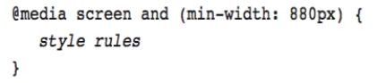
(37) When creating a responsive design, you create a(n) __________ at a width where the layout no longer looks good, or where you'd like to move elements or add or remove content.
(Multiple Choice)
4.7/5 (33)
(33) Instead of testing on actual mobile devices, you can use an application known as a(n) emulator._________________________
(True/False)
4.8/5 (39)
(39) To create a web page using responsive design, you start by creating a layout that's optimized for
(Multiple Choice)
4.7/5 (28)
(28)
 -Referring to the figure above, the word and represents a
-Referring to the figure above, the word and represents a (Multiple Choice)
4.8/5 (45)
(45)
-Referring to the figure above, which of the following describes when the code applies?
-Referring to the figure above, which of the following describes when the code applies? (Multiple Choice)
4.9/5 (37)
(37)
 -Referring to the figure above, which aspect of responsive design does the figure illustrate?
-Referring to the figure above, which aspect of responsive design does the figure illustrate? (Multiple Choice)
4.8/5 (35)
(35) Responsive design relies mainly on the min-height and max-height media features.
(True/False)
4.9/5 (43)
(43) You should never limit the amount of content shown by default on a smaller screen.
(True/False)
4.8/5 (31)
(31) When your default layout is optimized forsmall screens, then the mediaquery for your first breakpoint would use the __________ media feature.
(Multiple Choice)
4.9/5 (44)
(44) Which of the following recreates a CSS feature for older browsers using JavaScript code?
(Multiple Choice)
4.7/5 (42)
(42) Specifying a background color as a fallback for a background image is an example of a shim.
(True/False)
4.8/5 (34)
(34) To create a web page using responsive design, you start by creating a layout that's optimized for both the smallest and the largest screen size you want to support.
(True/False)
4.9/5 (40)
(40) 
Filters
- Essay(0)
- Multiple Choice(0)
- Short Answer(0)
- True False(0)
- Matching(0)