Exam 3: Describing Data Visually
Exam 1: Overview of Statistics52 Questions
Exam 2: Data Collection111 Questions
Exam 3: Describing Data Visually108 Questions
Exam 4: Descriptive Statistics150 Questions
Exam 5: Probability123 Questions
Exam 6: Discrete Probability Distributions126 Questions
Exam 7: Continuous Probability Distributions120 Questions
Exam 8: Sampling Distributions and Estimation106 Questions
Exam 9: One-Sample Hypothesis Tests147 Questions
Exam 10: Two-Sample Hypothesis Tests113 Questions
Exam 11: Analysis of Variance126 Questions
Exam 12: Simple Regression135 Questions
Exam 13: Multiple Regression130 Questions
Exam 14: Time Series Analysis114 Questions
Exam 15: Chi-Square Tests99 Questions
Exam 16: Nonparametric Tests85 Questions
Exam 17: Quality Management108 Questions
Select questions type
Below is a frequency distribution of earnings of 50 contractors in a country. Earnings Number of (thousands) Contractors 1-10 2 11-20 7 20-30 12 31-40 15 41-50 8 50-60 6 Regarding this distribution, which of the following is correct?
(Multiple Choice)
4.9/5  (28)
(28)
Briefly list strengths and weaknesses of this display. Cite specific principles of good graphs, as well as offering your own general interpretation.
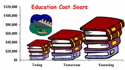
(Essay)
4.8/5 (34)
A column chart would be least suitable to display which data?
(Multiple Choice)
4.9/5 (38)
In a bimodal histogram, the two highest bars will have the same height.
(True/False)
4.9/5 (37)
Dot plots may not reveal the shape of a distribution when the sample is small.
(True/False)
4.9/5 (35)
Below is a sorted stem-and-leaf diagram for the measured speeds (miles per hour) of 49 randomly chosen vehicles on highway I-80 in Nebraska. What is the mode? stem unit
leaf unit
Frequency Stem Leaf 1 4 9 1 5 5 17 6 01222455556688999 19 7 0111233345666778999 7 8 0133557 4 9 0122 49
(Multiple Choice)
4.8/5 (33)
A study found the following parts per billion of nitrosamines in a sample of domestic beers. (a) Construct a frequency distribution of four classes with equal class sizes. (b) Construct another frequency distribution of four classes using unequal class intervals or an open-ended interval for the highest class. (c) Which frequency distribution is preferable? Why?
1.00 1.72 2.51 4.21 1.05 1.88 2.61 4.50 1.17 2.16 2.84 6.36 1.50 2.23 2.96 6.70 1.63 2.26 2.99 6.72 1.70 2.45 3.41 15.75
(Essay)
4.8/5 (29)
Briefly list strengths and weaknesses of this display. Cite specific principles of good graphs, as well as offering your own general interpretation.
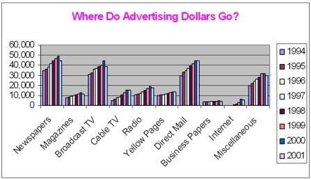
(Essay)
5.0/5 (39)
Ten part-time servers at a high-end restaurant were asked how many hours they worked last week and how much they earned. The results are shown below. (a) Make a scatter plot. (b) Describe it. (c) What is your best guess of the average hourly pay?
Work Hours Last Week's Pay 5 75 7 70 10 150 15 195 21 210 25 350 33 495 35 315 40 320 45 495
(Essay)
4.7/5 (39)
The number of bins in this histogram (caffeine content in mg/oz for 65 soft drinks) is consistent with Sturges' Rule. 
(True/False)
4.8/5 (38)
If you have 256 data points, how many classes (bins) would Sturges' Rule suggest?
(Multiple Choice)
4.9/5 (32)
Bob found an error in the following frequency distribution. What is it? Class Frequency 1-10 2 11-20 6 25-30 8 31-40 12 44-50 6
(Multiple Choice)
4.8/5 (28)
A column chart can sometimes be used instead of a line chart for time series data.
(True/False)
4.8/5 (35)
The width of a class in a frequency distribution is known as the:
(Multiple Choice)
4.9/5 (33)
Scatter plots are used to visualize association in samples of paired data (X, Y).
(True/False)
4.9/5 (33)
The column chart should be avoided if you are plotting time series data.
(True/False)
4.7/5 (38)
Filters
- Essay(0)
- Multiple Choice(0)
- Short Answer(0)
- True False(0)
- Matching(0)