Exam 3: Describing Data Visually
Exam 1: Overview of Statistics52 Questions
Exam 2: Data Collection111 Questions
Exam 3: Describing Data Visually108 Questions
Exam 4: Descriptive Statistics150 Questions
Exam 5: Probability123 Questions
Exam 6: Discrete Probability Distributions126 Questions
Exam 7: Continuous Probability Distributions120 Questions
Exam 8: Sampling Distributions and Estimation106 Questions
Exam 9: One-Sample Hypothesis Tests147 Questions
Exam 10: Two-Sample Hypothesis Tests113 Questions
Exam 11: Analysis of Variance126 Questions
Exam 12: Simple Regression135 Questions
Exam 13: Multiple Regression130 Questions
Exam 14: Time Series Analysis114 Questions
Exam 15: Chi-Square Tests99 Questions
Exam 16: Nonparametric Tests85 Questions
Exam 17: Quality Management108 Questions
Select questions type
Because most data values are on the left, we would say that this dot plot (burglary rates per 100,000 persons in 350 U.S. cities) shows a distribution that is skewed to the left (negatively skewed). 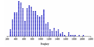
(True/False)
4.8/5  (39)
(39)
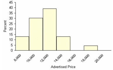
Here are advertised prices of 23 used Chevy Impalas. Describe the distribution's shape. Is the number of histogram classes correct?
(Essay)
4.7/5 (35)
It is possible to construct a histogram or frequency polygon with open-ended classes.
(True/False)
4.7/5 (42)
Students were given a take-home statistics assignment and were asked to write down how long it took them (in minutes). Their answers are shown below. (a) Make a dot plot. (b) Use your judgment to construct a frequency distribution using whatever classes (bins) you wish. (c) Make a histogram. (d) Describe the distribution. (e) Did your bin choices agree with Sturges' Rule? If not, why not?
(Essay)
4.9/5 (36)
The zero origin rule may be waived for column or line charts if the objective is merely to visualize relative change over time.
(True/False)
4.7/5 (35)
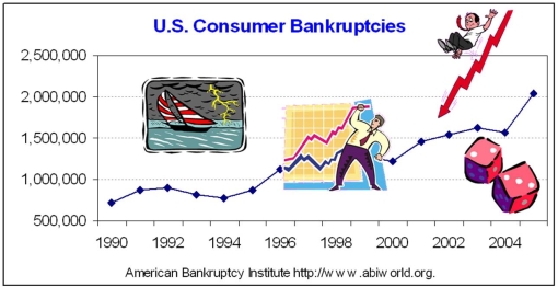
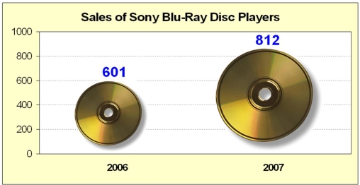
Briefly list strengths and weaknesses of this display. Cite specific principles of good graphs, as well as offering your own general interpretation.
(Essay)
4.8/5 (40)
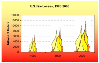
Briefly list strengths and weaknesses of this display. Cite specific principles of good graphs, as well as offering your own general interpretation.
(Essay)
4.9/5 (33)
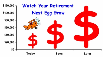
Briefly list strengths and weaknesses of this display. Cite specific principles of good graphs, as well as offering your own general interpretation.
(Essay)
4.7/5 (36)
Which is not a reason why pie charts are popular in business?
(Multiple Choice)
4.8/5 (33)
Except for the Y-axis scaling, a histogram will look the same if we use relative frequencies instead of raw frequencies (with the same bin limits).
(True/False)
4.8/5 (41)
Which display is most likely to reveal association between X and Y?
(Multiple Choice)
5.0/5 (34)
The ______________ can be used to differentiate the "vital few" causes of quality problems from the "trivial many" causes of quality problems.
(Multiple Choice)
4.8/5 (31)
The point halfway between the bin limits in a frequency distribution is known as the:
(Multiple Choice)
4.7/5 (37)
Briefly list strengths and weaknesses of this display. Cite specific principles of good graphs, as well as offering your own general interpretation.
(Essay)
4.9/5 (35)
Which of the following is least useful in visualizing categorical data?
(Multiple Choice)
4.8/5 (32)
Filters
- Essay(0)
- Multiple Choice(0)
- Short Answer(0)
- True False(0)
- Matching(0)