Multiple Choice
The scatterplot below displays the amount of nitrous oxide (NO) explained by the amount of carbon monoxide (CO) emissions in million metric tons over a ten year period in the United States. Select the choice that best describes any relationship between the variables. 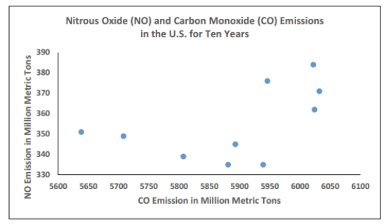
A) There is a negative linear association between NO and CO.
B) There is a positive linear association between NO and CO.
C) Overall, there is no noticeable relationship between NO and CO.
D) NO can be explained by CO.
Correct Answer:

Verified
Correct Answer:
Verified
Q14: The following frequency distribution represents the
Q15: A nurse measured the blood pressure
Q16: The histogram below represents the number of
Q17: The following data show the number
Q18: The frequency table below shows the
Q20: <span class="ql-formula" data-value="\begin{array} { c c c
Q21: A school district performed a study
Q22: The histogram below represents the number of
Q23: The ages of the 45 members
Q24: Analysis of the data from 25 mothers