Multiple Choice
Make a scatter diagram for the data.
-The table shows the life expectancy at birth for females and per capita GDP for nine countries. (Data for 1995) Plot per capita GDP on the horizontal axis and life expectancy on the vertical axis. 
A) 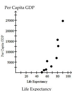
B) 
C) 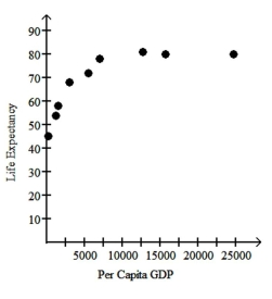
D) 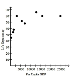
Correct Answer:

Verified
Correct Answer:
Verified
Q174: Construct a line chart for the
Q175: Use the guidelines to evaluate the study.
Q176: Answer the question.<br>-The bar graph below shows
Q177: The graph below shows estimated world
Q178: Use the graph to answer the question.<br>-The
Q180: Describe how you would apply the five
Q181: State whether the scatter diagram shows strong
Q182: Provide an appropriate response.<br>-Construct a frequency table
Q183: Use the graph to answer the question.<br>-<img
Q184: Describe how you would apply the five