Short Answer
The stacked bar chart below shows the percentages of death due to cancer in four geographic regions of the U.S. that occurred in three ethnic groups in 2003. 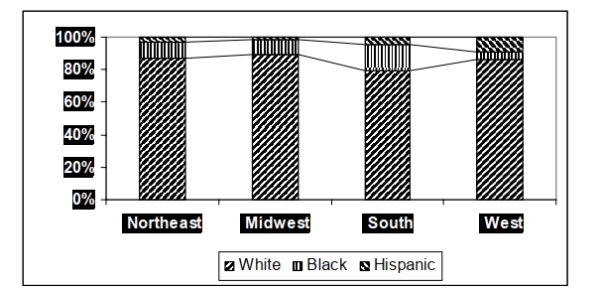 In which geographic area did Hispanics account for their highest percentage of cancer deaths
in 2003?
Correct Answer:

Verified
Correct Answer:
Verified
Q19: States with high deer populations have
Q20: On Monday mornings, a bookie tabulates the
Q21: A nurse measured the blood pressure of
Q22: The frequency table shows the lengths
Q23: The time series line chart below shows
Q25: The data below represent the results
Q26: The table shows the end-of-the-month checking
Q27: Find the original data from the
Q28: Using the graphical display below.<br> <img src="https://d2lvgg3v3hfg70.cloudfront.net/TB2967/.jpg"
Q29: The table shows the price of