Multiple Choice
Following is a pie chart that presents the percentages spent by a certain household on its five largest annual expenditures. What percentage of the money spent was spent on food, housing, and utilities? 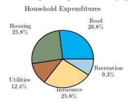
A) 52.6%
B) 65%
C) 61.9%
D) 50%
Correct Answer:

Verified
Correct Answer:
Verified
Q30: The following time-series plot presents the population
Q31: Following are the numbers of Dean's
Q32: Construct a dotplot for the following
Q33: Chocolate or vanilla: The following bar graph
Q34: The following frequency distribution presents the
Q35: The following table presents the purchase
Q36: The following table presents the purchase
Q38: The following table presents the purchase
Q39: One hundred students are shown an eight-digit
Q40: The following frequency distribution presents the