Short Answer
Chocolate or vanilla: The following bar graph shows the number of chocolate and vanilla ice cream cones sold during the annual county fair for the years 2013 - 2017. Does the graph present an accurate picture of the difference between chocolate and vanilla cones sold? Or is it misleading?
Explain. 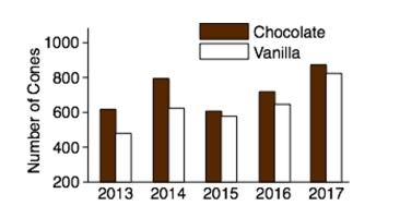
Correct Answer:

Verified
Correct Answer:
Verified
Q28: The amounts 3 and 4 are compared.
Q29: The following pie chart presents the percentages
Q30: The following time-series plot presents the population
Q31: Following are the numbers of Dean's
Q32: Construct a dotplot for the following
Q34: The following frequency distribution presents the
Q35: The following table presents the purchase
Q36: The following table presents the purchase
Q37: Following is a pie chart that presents
Q38: The following table presents the purchase