Essay
Construct a pie chart representing the given data set.
-A television manufacturer sold three times as many televisions in 2005 as it did in 1995. To illustrate this fact,
the manufacturer draws a graph as shown below. The television on the right is three times as tall and three
times as wide as the television on the left. Why is this graph misleading? What visual impression is created by
the graph? 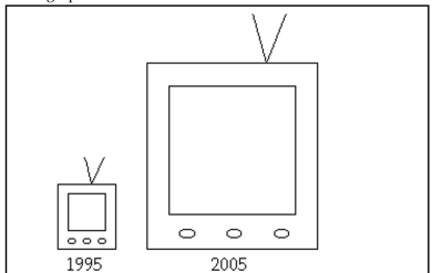
Correct Answer:

Verified
The area of the television on the right ...View Answer
Unlock this answer now
Get Access to more Verified Answers free of charge
Correct Answer:
Verified
View Answer
Unlock this answer now
Get Access to more Verified Answers free of charge
Q6: Consider the frequency distribution below, which
Q7: Construct a pie chart representing the given
Q8: Kevin asked some of his friends
Q9: Consider the frequency distribution below, which
Q10: The frequency distribution below summarizes the
Q12: Analysis of the data from 25
Q13: The following data set represents Heather's
Q14: <span class="ql-formula" data-value="\begin{array} { r r r
Q15: Construct a pie chart representing the
Q16: The frequency distribution for the weekly