Multiple Choice
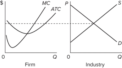 The graphs are for a purely competitive market in the short run. The graphs suggest that in the long run, assuming no changes in the given information,
A) some firms will exit from this industry.
B) more buyers will come to the market.
C) new firms will be attracted into the industry.
D) buyers will leave the industry.
Correct Answer:

Verified
Correct Answer:
Verified
Q17: Compare the shape of a long-run supply
Q18: If the representative firm in a purely
Q19: If the price of bottled water is
Q20: <img src="https://d2lvgg3v3hfg70.cloudfront.net/TB8602/.jpg" alt=" If the competitive
Q21: When firms in a purely competitive industry
Q23: <img src="https://d2lvgg3v3hfg70.cloudfront.net/TB8602/.jpg" alt=" Refer to the
Q24: <img src="https://d2lvgg3v3hfg70.cloudfront.net/TB8602/.jpg" alt=" Line (2)in the
Q25: Suppose that an industry's long-run supply curve
Q26: <img src="https://d2lvgg3v3hfg70.cloudfront.net/TB8602/.jpg" alt=" The accompanying graph
Q27: Suppose an increase in product demand occurs