Multiple Choice
The following graph shows the percent of adults who are overweight or obese in countries with different income levels, based on 2010 data from the World Health Organization and the United Nations.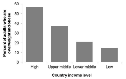 What is the correct description of this graph?
A) Bar graph
B) Histogram with a clear right skew
C) Histogram with a clear left skew
D) Boxplot
Correct Answer:

Verified
Correct Answer:
Verified
Q27: A survey records many variables of interest
Q28: A sample of 40 endangered species was
Q29: The following histogram shows the yearly number
Q30: The following graph shows the percent of
Q31: The following dotplot shows migraine intensity (on
Q33: Some variables were recorded while surveying plants
Q34: The U.S. Global Change Research Program examined
Q35: What is important to do when drawing
Q36: The U.S. Global Change Research Program examined
Q37: Stream quality is based on the levels