Multiple Choice
The following graph shows the percent of adults who are overweight or obese in countries with different income levels, based on 2010 data from the World Health Organization and the United Nations.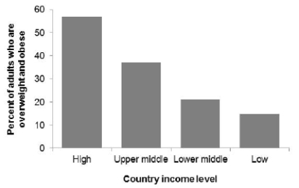 Which of the following statements about these data is correct?
A) The majority of adults who are overweight or obese live in high-income countries.
B) The majority of adults who live in high-income countries are overweight or obese.
C) Both statements are correct.
D) Both statements are incorrect.
Correct Answer:

Verified
Correct Answer:
Verified
Q21: The following table shows the percent
Q22: Opioid pain relievers are prescribed at a
Q23: During winter, red foxes hunt small rodents
Q24: For a biology lab course containing
Q25: The estimated annual number of smoking-attributable
Q27: A survey records many variables of interest
Q28: A sample of 40 endangered species was
Q29: The following histogram shows the yearly number
Q30: The following graph shows the percent of
Q31: The following dotplot shows migraine intensity (on