Multiple Choice
The following figure shows the revenue and cost curves of a monopolist. Figure 10.3 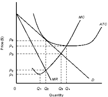
D: Average Revenue
MR: Marginal Revenue
ATC: Average Total Cost
MC: marginal Cost
-Consider the monopolist described in Figure 10.3.The firm can maximize profit by producing:
A) zero units.
B) Q1 units.
C) Q2 units.
D) Q3 units.
E) Q4 units.
Correct Answer:

Verified
Correct Answer:
Verified
Q1: The figure given below shows the cost
Q52: The following figure shows revenue and cost
Q54: When Glaxo-Wellcome introduced AZT,an AIDS drug,it was
Q56: The following figure shows the revenue curves
Q59: The following table shows the units of
Q62: The ability of a firm to charge
Q72: The figure given below shows the aggregate
Q84: The figure given below shows the cost
Q88: The figure given below shows the cost
Q115: The figure given below shows the cost