Multiple Choice
Thirty students at Eastside High School took the SAT on the same Saturday.Their raw scores are given next. 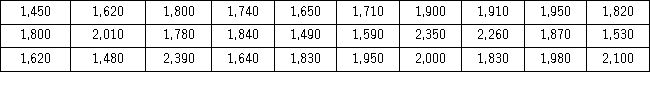 Consider a frequency distribution of the data that groups the data in classes of 1400 up to 1600,1600 up to 1800,1800 up to 2000,and so on.What graphical tool would you use to display the cumulative relative frequency of the grouped data?
A) Ogive
B) Polygon
C) Pie chart
D) Bar chart
Correct Answer:

Verified
Correct Answer:
Verified
Q59: What may be revealed from a scatterplot?<br>A)
Q80: Consider the following frequency distribution. <img src="https://d2lvgg3v3hfg70.cloudfront.net/TB4266/.jpg"
Q81: An auto parts chain asked customers to
Q82: The dividend yields of the stocks in
Q83: Students in Professor Smith's business statistics course
Q84: A survey of 400 unemployed people was
Q86: The accompanying relative frequency distribution represents the
Q87: In the accompanying stem-and-leaf diagram,the values in
Q88: The following table shows analyst sentiment ratings
Q90: Consider the following frequency distribution. <img src="https://d2lvgg3v3hfg70.cloudfront.net/TB4266/.jpg"