Exam 9: Working With Charts
Exam 1: Getting Started With Windows 866 Questions
Exam 2: Understanding File Management65 Questions
Exam 3: Getting Started With Microsoft Office 201371 Questions
Exam 4: Creating a Document71 Questions
Exam 5: Enhancing a Document68 Questions
Exam 6: Adding Special Elements to a Document66 Questions
Exam 7: Creating and Enhancing a Worksheet66 Questions
Exam 8: Using Complex Formulas, Functions, and Tables66 Questions
Exam 9: Working With Charts66 Questions
Exam 10: Creating a Database66 Questions
Exam 11: Working With Data65 Questions
Exam 12: Creating Database Reports62 Questions
Exam 13: Creating a Presentation62 Questions
Exam 14: Polishing and Running a Presentation66 Questions
Exam 15: Integrating Office Programs59 Questions
Exam 16: Working in the Cloud52 Questions
Exam 17: Understaning Essential Unit Concepts62 Questions
Select questions type
Your supervisor has created a spreadsheet and a chart is included in the workbook.
Your supervisor thinks the chart legend is too large, how should you fix the chart?
Free
(Essay)
4.8/5  (38)
(38)
Correct Answer: Verified
Click on the legend, then drag one of its sizing handles to make it smaller.
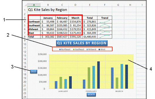 In the accompanying figure, item 4 points to the ____.
Free
(Multiple Choice)
4.8/5 (32)
Correct Answer:Verified
A
 In the accompanying figure, there are ____ categories.
Free
(Multiple Choice)
4.9/5 (31)
Correct Answer:Verified
D
A worksheet is a much more effective way to communicate data to an audience than a chart.
(True/False)
4.9/5 (33)
In a worksheet, you select the cells that contain the data you want to chart, and then click the Recommended Charts button on the INSERT tab to choose from a selection of chart types
(True/False)
4.8/5 (36)
The _____________________ is the part of the chart contained within the horizontal and vertical axes.
(Short Answer)
4.9/5 (33)
You put together a spreadsheet for your company containing the quarterly sales figures for each region. Each column of the spreadsheet represents a quarter and each row represents a department's figures.
Describe which chart type you should use to show how three of the departments compared to each other for all of the quarters.
(Short Answer)
4.8/5 (29)
A ____ chart is an effective tool for comparing the relative values of parts to a whole.
(Multiple Choice)
4.9/5 (39)
The Offset Bottom Shadow style is an example of a shape _______________ that can be added to a chart element.
(Short Answer)
4.9/5 (29)
You can change one type of chart to another by clicking the Change Chart Type button on the CHANGE TOOLS DESIGN tab
(True/False)
4.8/5 (26)
A(n) _____________________ in a chart is a grid containing the chart's underlying worksheet data.
(Short Answer)
4.8/5 (36)
The ____ is the vertical line that defines the left edge of the chart and provides values.
(Multiple Choice)
4.8/5 (34)
Your supervisor has created a spreadsheet and a chart is included in the workbook.
Describe how you should change the chart to have an overall theme of purple elements.
(Essay)
4.9/5 (42)
To remove a data table from a chart click the Data Table check box in the Chart _____________ menu to remove it.
(Short Answer)
4.8/5 (31)
It is important to organize your rows and columns of data so that when you create a chart, it illustrates the points you want to make.
(True/False)
4.8/5 (44)
It is possible to move a chart to a new location on the worksheet after it has been created.
(True/False)
4.9/5 (29)
If data labels on a chart are too small to read you can increase their ____ size before printing the chart.
(Multiple Choice)
4.9/5 (36)
To modify chart element text, such as a title, click in the ____ text.
(Multiple Choice)
4.9/5 (38)
Filters
- Essay(0)
- Multiple Choice(0)
- Short Answer(0)
- True False(0)
- Matching(0)