Exam 11: Displaying Distributions With Graphs
Exam 1: Where Do Data Come From30 Questions
Exam 2: Samples, Good and Bad30 Questions
Exam 3: What Do Samples Tell Us55 Questions
Exam 4: Sample Surveys in the Real World36 Questions
Exam 5: Experiments, Good and Bad50 Questions
Exam 6: Experiments in the Real World32 Questions
Exam 7: Data Ethics21 Questions
Exam 8: Measuring33 Questions
Exam 9: Do the Numbers Make Sense25 Questions
Exam 10: Graphs, Good and Bad30 Questions
Exam 11: Displaying Distributions With Graphs22 Questions
Exam 13: Normal Distributions54 Questions
Exam 14: Describing Relationships: Scatterplots and Correlation56 Questions
Exam 15: Describing Relationships: Regression, Prediction, and Causation37 Questions
Exam 16: The Consumer Price Index and Government Statistics31 Questions
Exam 17: Thinking About Chance25 Questions
Exam 18: Probability Models30 Questions
Exam 19: Simulation20 Questions
Exam 20: The House Edge: Expected Values30 Questions
Exam 21: What Is a Confidence Interval43 Questions
Exam 22: What Is a Test of Significance30 Questions
Exam 23: Use and Abuse of Statistical Inference18 Questions
Exam 24: Two-Way Tables and the Chi-Square Test47 Questions
Select questions type
You are writing an article for the college newspaper about the cost of attending college. You want to make a graph to compare costs at your school and three similar schools. A good choice of a graph would be a
Free
(Multiple Choice)
4.7/5  (31)
(31)
Correct Answer: Verified
A
Below is a histogram of the ages of the professors at a large university. 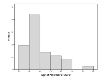 Approximately what percentage of the professors are 30-39 years old?
Free
(Multiple Choice)
4.8/5 (38)
Correct Answer:Verified
B
Below is a histogram of the number of repetitions of a chin-up exercise the members of two high school gym classes could do. For reference: the minimum done was two students doing none; the most, two students doing 12. 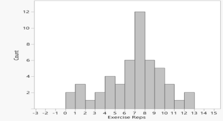 Approximately how many students did fewer than the 10 repetitions recommended by the presidential fitness guidelines?
Free
(Multiple Choice)
4.8/5 (31)
Correct Answer:Verified
C
One of the following 12 scores
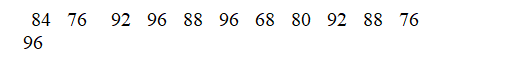 Was omitted from the stemplot below:
  The missing score is
(Multiple Choice)
4.8/5 (30)
You want to make a graph to display the distribution of the salaries of the 1500 professors at a very large university. The best choice is a
(Multiple Choice)
4.9/5 (34)
You want to make a graph to display the distribution of the years of experience of the 17 professors in the math department of a large university. The best choice is:
(Multiple Choice)
4.9/5 (30)
Which of the stemplots below correctly displays the following data values?
5)6 8.5 6.3 6.1 5.6 8.5 8.2 8.1 6.7 8.5 5.8 5.1 8.5
(Multiple Choice)
4.8/5 (35)
To display the percent of likely voters who believe they are going to vote for a particular candidate according to a survey taken each week of an election year, starting in January and ending the last week of October, a good choice of a graph would be a:
(Multiple Choice)
4.7/5 (42)
Below is a histogram of the number of repetitions of a chin-up exercise the members of two high school gym classes could do. For reference: the minimum done was two students doing none; the most, two students doing 12.  Approximately how many students were included in this study?
(Multiple Choice)
4.9/5 (35)
Ten members of a fraternity take a statistics course. Here are their scores on the first exam in the course:
 To present the distribution of scores in a graph, you might choose a
(Multiple Choice)
4.7/5 (39)
You want to make a graph that shows how the cost of attending your school has increased since 1980. A good choice of graph would be a
(Multiple Choice)
4.8/5 (36)
Below is a histogram of the number of repetitions of a chin-up exercise the members of two high school gym classes could do. For reference: the minimum done was two students doing none; the most, two students doing 12.  The overall shape of this distribution is
(Multiple Choice)
4.7/5 (34)
Below is a histogram of the ages of the professors at a large university.  There are 800 professors at this university. How many of them are in their 70s?
(Multiple Choice)
4.7/5 (45)
Below is a histogram of the ages of the professors at a large university.  The overall shape of this distribution is
(Multiple Choice)
4.8/5 (39)
To display the number of pets owned by each of the 37 students in a class, a good choice of a graph would be a
(Multiple Choice)
5.0/5 (29)
Below is a stemplot of the scores on a recent statistics test. (Key: 8|2 = 82%) 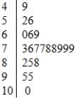 The overall shape of this distribution is
(Multiple Choice)
4.9/5 (36)
An analyst wants to draw a graph that displays the distribution of the tuitions of the 400+ institutions of higher learning in her state. The best type of graph to use is a:
(Multiple Choice)
4.8/5 (27)
Below is a stemplot of the percent of males, 15 and older, who are illiterate in 139 countries, according to the United Nations. For example, the highest illiteracy rate was 69%, in the African country of Mali. 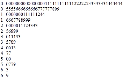
(Multiple Choice)
4.8/5 (33)
Here is a set of data: 1300, 18, 25, 19, -7, 24. Which observation is the outlier?
(Multiple Choice)
4.8/5 (37)
Filters
- Essay(0)
- Multiple Choice(0)
- Short Answer(0)
- True False(0)
- Matching(0)