Exam 2: Frequency Distributions and Graphs
Exam 1: The Nature of Probability and Statistics47 Questions
Exam 2: Frequency Distributions and Graphs73 Questions
Exam 3: Data Description73 Questions
Exam 4: Probability and Counting Rules85 Questions
Exam 5: Discrete Probability Distributions69 Questions
Exam 6: The Normal Distribution81 Questions
Exam 7: Confidence Intervals and Sample Size75 Questions
Exam 8: Hypothesis Testing83 Questions
Exam 9: Testing the Difference Between Two Means, Two Variances, and Two Proportions70 Questions
Exam 10: Correlation and Regression63 Questions
Exam 11: Other Chi-Square Tests47 Questions
Exam 12: Analysis of Variance54 Questions
Exam 13: Nonparametric Statistics63 Questions
Exam 14: Sampling and Simulation58 Questions
Select questions type
If the limits for a class were 20-38, the boundaries would be 19.5-38.5.
Free
(True/False)
4.9/5  (41)
(41)
Correct Answer: Verified
True
A recent statistics exam yielded the following 25 scores. Construct a grouped frequency distribution with the class limits shown below.
61 90 79 57 63
55 83 70 62 95
90 83 41 72 85
76 82 75 94 57
72 72 46 81 93 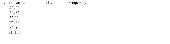
Free
(Multiple Choice)
4.8/5 (34)
Correct Answer:Verified
A
Thirty students recorded the colors of their eyes, choosing from the colors brown, blue, green, hazel, and black. This data can be appropriately summarized in a(n)______________ .
Free
(Multiple Choice)
4.8/5 (45)
Correct Answer:Verified
B
Construct a frequency polygon from the following frequency distribution. 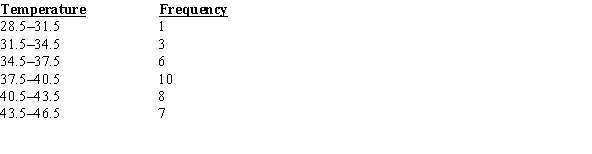
(Essay)
4.9/5 (30)
Using the ogive shown below, what is the cumulative frequency of data values less than or equal to 16 ? 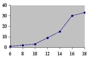
(Multiple Choice)
4.7/5 (40)
The frequency polygon and the histogram are two different ways to represent the same data set.
(True/False)
4.8/5 (35)
In an ungrouped frequency distribution of the average age of high school graduates, what would be the boundaries for the class of graduates who were reported to be 18 years old?
(Multiple Choice)
4.9/5 (41)
A histogram is a graph that represents the cumulative frequencies for the classes in a frequency distribution.
(True/False)
4.8/5 (38)
When making Pareto charts, data should be arranged ________________________ according to frequency.
(Multiple Choice)
4.8/5 (38)
A stem and leaf plot has the advantage over a grouped frequency distribution of retaining the actual data while still showing them in graphical form.
(True/False)
4.8/5 (30)
A recent statistics exam yielded the following 10 scores. Construct a frequency polygon distribution using the class limits shown below.
80, 99, 77, 67, 93, 70, 76, 86, 79, 71 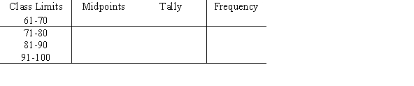
(Multiple Choice)
4.8/5 (30)
Karen is constructing a pie graph to represent the number of hours her classmates do homework each day. She found that 8 of 24 classmates did homework for three hours each day. In her pie graph, this would represent how many degrees?
(Multiple Choice)
4.8/5 (34)
Graphs that show distributions using proportions instead of raw data as frequencies are called
(Multiple Choice)
4.7/5 (31)
The frequency polygon is a graph that displays the data by using lines that connect points plotted for the frequencies at the midpoints of the classes.
(True/False)
4.9/5 (40)
The lower class limit represents the smallest data value that can be included in the class.
(True/False)
4.9/5 (46)
A weatherman records the amount of rain that fell in Portland, Oregon each day for a year. What type of graph should he use to show how rainfall changes during the year ?
(Multiple Choice)
4.8/5 (28)
Filters
- Essay(0)
- Multiple Choice(0)
- Short Answer(0)
- True False(0)
- Matching(0)