Multiple Choice
The following relative frequency distribution summarizes student responses to the question "If you could make your college choice over, would you still choose to enroll at your current college?"  Which of the following is the correct bar chart for the response data?
A) 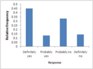
B) 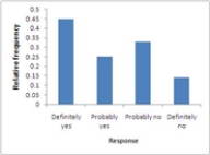
C) 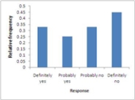
D) 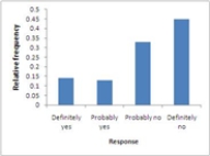
E) 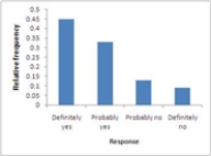
Correct Answer:

Verified
Correct Answer:
Verified
Q10: The cumulative relative frequency plot shown was
Q11: The annual household incomes, in thousands of
Q12: In the article, "Dimensional Relationships for Flying
Q13: Exhibit 2-2<br>In a story written in December
Q13: The relative frequency for a particular category
Q14: Exhibit 2-4<br>In the article, "Scaling of Mammalian
Q16: Investigators writing in the Journal of Early
Q18: The stem plot below displays the weights
Q19: The frequency distribution shown summarizes data on
Q20: A curve with tails that decline more