Multiple Choice
Following is a pie chart that presents the percentages spent by a certain household on its largest annual expenditures. What percentage of the money spent was spent on food, hous utilities?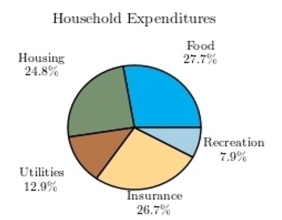
A) 65.4%
B) 47%
C) 60.4%
D) 52.5%
Correct Answer:

Verified
Correct Answer:
Verified
Related Questions
Q85: A sample of 200 high school
Q86: <span class="ql-formula" data-value="\text { Classify the histogram
Q87: The following pie chart presents the percentages
Q88: The following information shows the colors
Q89: A Pareto chart is useful for showing
Q91: The following table presents the purchase
Q92: What is the upper class boundary of
Q93: The following frequency distribution presents the
Q94: A recent statistics exam yielded the
Q95: A sample of 200 high school