Multiple Choice
The circle graph shows the number of blood donors of the following blood type who participated in the previous blood drive at a community college. Use the following graph. What percent of donors had blood type A+? Round to the nearest tenth of a percent. 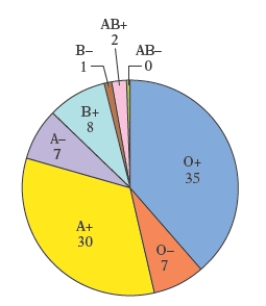
A) 30.1
B) 29.8
C) 33.3 
D) 29.6
E) 30.3
Correct Answer:

Verified
Correct Answer:
Verified
Q49: The circle graph shows the number
Q50: The life expectancies, in years, in
Q51: The pictograph in the following figure gives
Q52: The double-broken-line graph shows the number of
Q53: The total cholesterol readings for 40 female
Q55: The double-bar graph below shows the fuel
Q56: Most health statistics list normal body temperature
Q57: Each of the letters of the
Q58: The circle graph shows the number
Q59: Most health statistics list normal body