Exam 21: Graphs in Economics
Exam 1: First Principles199 Questions
Exam 2: Economic Models: Trade-Offs and Trade299 Questions
Exam 4: Consumer and Producer Surplus229 Questions
Exam 3: Supply and Demand265 Questions
Exam 5: Price Controls and Quotas: Meddling With Markets216 Questions
Exam 6: Elasticity226 Questions
Exam 7: Taxes286 Questions
Exam 8: International Trade260 Questions
Exam 9: Decision Making by Individuals and Firms186 Questions
Exam 10: The Rational Consumer182 Questions
Exam 11: Behind the Supply Curve: Inputs and Costs317 Questions
Exam 12: Perfect Competition and the Supply Curve341 Questions
Exam 13: Monopoly317 Questions
Exam 14: Oligopoly271 Questions
Exam 15: Monopolistic Competition and Product Differentiation245 Questions
Exam 16: Externalities193 Questions
Exam 17: Public Goods and Common Resources208 Questions
Exam 18: The Economics of the Welfare State126 Questions
Exam 19: Factor Markets and the Distribution of Income316 Questions
Exam 20: Uncertainty, Risk, and Private Information192 Questions
Exam 21: Graphs in Economics60 Questions
Exam 22: Consumer Preferences and Consumer Choice135 Questions
Select questions type
The fact that two variables always move together over time:
(Multiple Choice)
4.8/5  (31)
(31)
The relation between two variables that move in opposite directions is said to be:
(Multiple Choice)
4.8/5 (39)
Use the following to answer question: 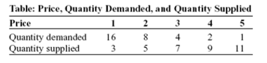 -(Table: Price,Quantity Demanded,and Quantity Supplied)Use Table: Price,Quantity Demanded,and Quantity Supplied.The slope of the line representing the relation between price on the vertical axis and quantity supplied on the horizontal axis is:
(Multiple Choice)
4.9/5 (33)
A _____ graph shows how the value of one or more variables has changed over some period.
(Multiple Choice)
4.8/5 (32)
The owner of the Dismal Philosopher,one of the five bookstores on College Road,asks you to make a graph showing each College Road bookstore's share of all five stores' book purchases.A good way to show this information is with a pie chart.
(True/False)
4.8/5 (34)
Use the following to answer question: 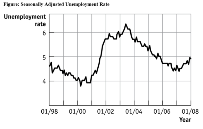 -(Figure: Seasonally Adjusted Unemployment Rate)Use Figure: Seasonally Adjusted Unemployment Rate.The distance between each labeled point on the horizontal axis is one year,and the distance between each labeled point on the vertical axis is one percentage point of unemployment.Unemployment was _____ between 1/2001 and 1/2002 and _____ between 1/1999 and 1/2000.
(Multiple Choice)
4.9/5 (33)
Use the following to answer question:
-(Table: Price,Quantity Demanded,and Quantity Supplied)Use Table: Price,Quantity Demanded,and Quantity Supplied.The slope of the line representing the relationship between price on the vertical axis and quantity demanded on the horizontal axis is:
(Multiple Choice)
4.8/5 (32)
Use the following to answer question: 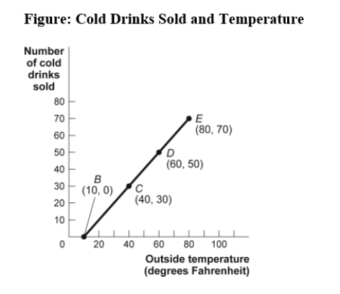 -(Figure: Cold Drinks Sold and Temperature)Use Figure: Cold Drinks Sold and Temperature.If we move from point C to point E in the figure,the outside temperature has _____ degrees and the number of cold drinks sold has _____.
(Multiple Choice)
4.9/5 (37)
The ratio of the change in the variable on the vertical axis to the change in the variable on the horizontal axis,measured between two points on the curve,is the:
(Multiple Choice)
4.7/5 (28)
Use the following to answer question: 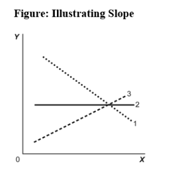 -(Figure: Illustrating Slope)Use Figure: Illustrating Slope.In the graph,line 3 depicts X and Y to be:
(Multiple Choice)
4.9/5 (34)
Use the following to answer question: 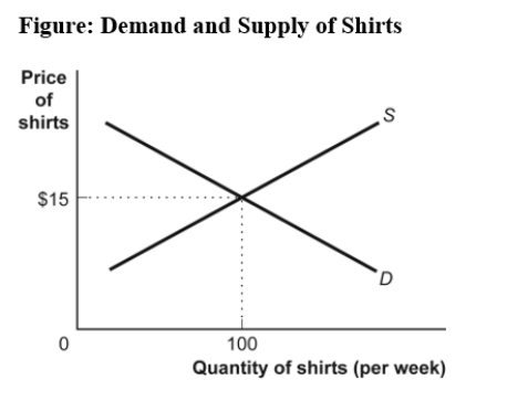 -(Figure: Demand and Supply of Shirts)Use Figure Demand and Supply of Shirts.If the line labeled S shows how many shirts per week will be offered for sale at various prices,then it is clear that,for supply,quantity and price are:
(Multiple Choice)
4.8/5 (37)
Use the following to answer question:
-(Figure: Seasonally Adjusted Unemployment Rate)Use Figure: Seasonally Adjusted Unemployment Rate.The distance between each labeled point on the horizontal axis is one year,and the distance between each labeled point on the vertical axis is one percentage point of unemployment.Using this graph,the unemployment rate was at its lowest point (in the time window)shown in _____ and at its highest point (in the time window shown)in _____.
(Multiple Choice)
4.9/5 (32)
Use the following to answer question:
-(Figure: Seasonally Adjusted Unemployment Rate)Use Figure: Seasonally Adjusted Unemployment Rate.The distance between each labeled point on the horizontal axis is one year,and the distance between each labeled point on the vertical axis is one percentage point of unemployment.What is the approximate slope of the graph between 1/2004 and 1/2006 (using percentage point and years as the units on the vertical and horizontal axes,respectively)?
(Multiple Choice)
4.8/5 (38)
Use the following to answer question:
-(Figure: Seasonally Adjusted Unemployment Rate)Use Figure: Seasonally Adjusted Unemployment Rate.The distance between each labeled point on the horizontal axis is one year,and the distance between each labeled point on the vertical axis is one percentage point of unemployment.Unemployment was _____ between 1/2001 and 1/2003 and _____ between 1/2007 and 1/2008.
(Multiple Choice)
4.8/5 (32)
Use the following to answer question:
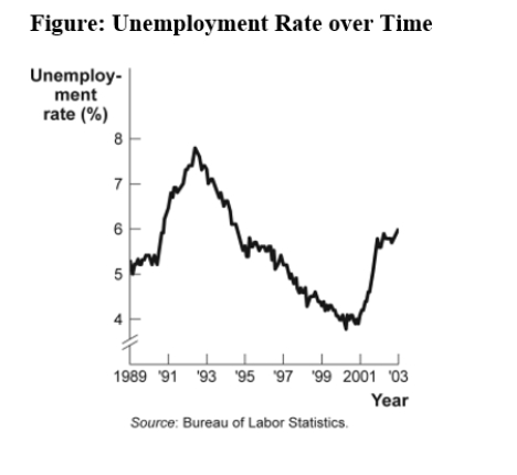 -(Figure: Unemployment Rate over Time)Look at the figure Unemployment Rate over Time.In the time-series graph,as we move from the beginning of 2001 to the beginning of 2003,we see that the unemployment rate has _____ from approximately _____ to approximately _____.
(Multiple Choice)
4.9/5 (34)
Use the following to answer question:
-(Figure: Cold Drinks Sold and Temperature)Use Figure: Cold Drinks Sold and Temperature.If we move from point B to point C in the figure,the outside temperature has _____ degrees and the number of cold drinks sold has _____.
(Multiple Choice)
4.8/5 (32)
Use the following to answer question:
-(Figure: Unemployment Rate over Time)Use Figure: Unemployment Rate over Time.In the time-series graph,as we move from 1997 to 2001,we see that the unemployment rate has _____ from approximately _____% to approximately _____%.
(Multiple Choice)
4.8/5 (39)
Use the following to answer question: 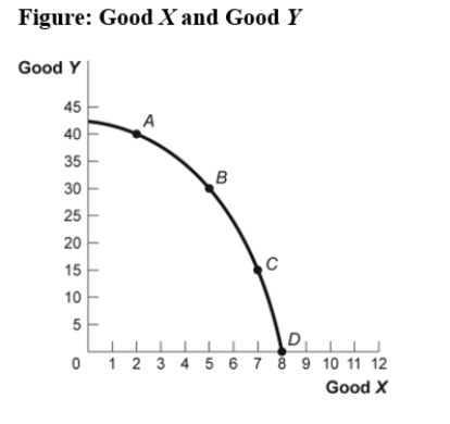 -(Figure: Good X and Good Y)Use Figure: Good X and Good Y.If we move from point C to point B in the figure,the x-variable has _____ units and the y-variable has _____ units.
(Multiple Choice)
4.9/5 (29)
Filters
- Essay(0)
- Multiple Choice(0)
- Short Answer(0)
- True False(0)
- Matching(0)