Exam 3: Data Visualization
Exam 1: Introduction35 Questions
Exam 2: Descriptive Statistics65 Questions
Exam 3: Data Visualization47 Questions
Exam 4: Descriptive Data Mining44 Questions
Exam 5: Probability: an Introduction to Modeling Uncertainty36 Questions
Exam 6: Statistical Inference47 Questions
Exam 7: Linear Regression46 Questions
Exam 8: Time Series Analysis and Forecasting41 Questions
Exam 9: Predictive Data Mining38 Questions
Exam 10: Spreadsheet Models49 Questions
Exam 11: Monte Carlo Simulation41 Questions
Exam 12: Linear Optimization Models38 Questions
Exam 13: Integer Linear Optimization Models42 Questions
Exam 14: Nonlinear Optimization Models46 Questions
Exam 15: Decision Analysis40 Questions
Select questions type
A two-dimensional graph representing the data using different shades of color to indicate magnitude is called a
(Multiple Choice)
4.8/5  (31)
(31)
An alternative for a stacked column chart when comparing more than a couple of quantitative variables in each category is a
(Multiple Choice)
4.7/5 (28)
In order to visualize three variables in a two-dimensional graph, we use a
(Multiple Choice)
4.9/5 (30)
A _____________ is a line that provides an approximation of the relationship between the variables.
(Multiple Choice)
4.8/5 (30)
This Excel bar chart displays the demographics of a Business Analysis class. Approximately how many students are in the class? 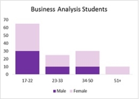
(Multiple Choice)
4.7/5 (33)
A disadvantage of stacked-column charts and stacked-bar charts is that
(Multiple Choice)
4.8/5 (34)
Fields may be chosen to represent all of the following except ____________ in the body of a PivotTable.
(Multiple Choice)
4.9/5 (29)
Filters
- Essay(0)
- Multiple Choice(0)
- Short Answer(0)
- True False(0)
- Matching(0)