Exam 35: The Short-Run Tradeoff Between Inflation and Unemployment
Exam 1: Ten Principles of Economics455 Questions
Exam 2: Thinking Like an Economist643 Questions
Exam 3: Interdependence and the Gains From Trade547 Questions
Exam 4: The Market Forces of Supply and Demand693 Questions
Exam 5: Elasticity and Its Application626 Questions
Exam 6: Supply, Demand, and Government Policies668 Questions
Exam 7: Consumers, Producers, and the Efficiency of Markets547 Questions
Exam 8: Applications: the Costs of Taxation509 Questions
Exam 9: Application: International Trade521 Questions
Exam 10: Externalities543 Questions
Exam 11: Public Goods and Common Resources452 Questions
Exam 12: The Design of the Tax System664 Questions
Exam 13: The Costs of Production649 Questions
Exam 14: Firms in Competitive Markets604 Questions
Exam 15: Monopoly662 Questions
Exam 16: Monopolistic Competition649 Questions
Exam 17: Oligopoly522 Questions
Exam 18: The Markets for the Factors of Production592 Questions
Exam 19: Earnings and Discrimination511 Questions
Exam 20: Income Inequality and Poverty478 Questions
Exam 21: The Theory of Consumer Choice570 Questions
Exam 22: Frontiers in Microeconomics461 Questions
Exam 23: Measuring a Nation S Income547 Questions
Exam 24: Measuring the Cost of Living565 Questions
Exam 25: Production and Growth527 Questions
Exam 26: Saving, Investment, and the Financial System637 Questions
Exam 27: Tools of Finance534 Questions
Exam 28: Unemployment and Its Natural Rate701 Questions
Exam 29: The Monetary System540 Questions
Exam 30: Money Growth and Inflation504 Questions
Exam 31: Open-Economy Macroeconomics: Basic Concepts540 Questions
Exam 32: A Macroeconomic Theory of the Open Economy511 Questions
Exam 33: Aggregate Demand and Aggregate Supply572 Questions
Exam 34: The Influence of Monetary and Fiscal Policy on Aggregate Demand523 Questions
Exam 35: The Short-Run Tradeoff Between Inflation and Unemployment536 Questions
Exam 36: Six Debates Over Macroeconomic Policy354 Questions
Select questions type
Typical estimates of the sacrifice ratio suggest that about 10 percent of annual output has to be given up in order to reduce the inflation rate from
(Multiple Choice)
4.9/5  (48)
(48)
If a government redesigned its unemployment insurance programs so that the unemployed had greater incentives to quickly find appropriate jobs, then which of the following curves would shift right?
(Multiple Choice)
4.8/5 (37)
Suppose that the money supply decreases. In the short run, this increases prices according to
(Multiple Choice)
4.8/5 (42)
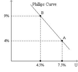
Figure 35-7
Use the two graphs in the diagram to answer the following questions. 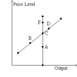
 -Refer to Figure 35-7. The economy would move from C to B
(Multiple Choice)
4.8/5 (33)
If unemployment is below its natural rate, what happens to move the economy to long-run equilibrium?
(Multiple Choice)
4.8/5 (29)
In the long run, an increase in the money supply growth rate
(Multiple Choice)
4.7/5 (45)
If the central bank raises the rate at which it increases the money supply, then in the short run unemployment is
(Multiple Choice)
4.8/5 (43)
Figure 35-1. The left-hand graph shows a short-run aggregate-supply (SRAS) curve and two aggregate-demand (AD) curves. On the right-hand diagram, U represents the unemployment rate. 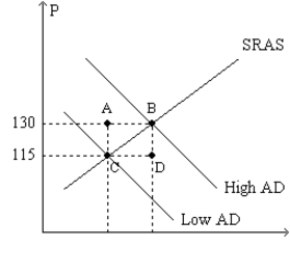
 -Refer to Figure 35-1. What is measured along the horizontal axis of the left-hand graph?
(Multiple Choice)
4.8/5 (30)
Friedman and Phelps argued that it was dangerous to think of the short-run Phillips curve as a menu of options for policymakers to choose from. Explain the logic of their argument.
(Essay)
4.8/5 (41)
According to Friedman and Phelps's analysis of the Phillips curve,
(Multiple Choice)
4.9/5 (43)
Proponents of rational expectations theory argued that, in the most extreme case, if policymakers are credibly committed to reducing inflation and rational people understand that commitment and quickly lower their inflation expectations, the sacrifice ratio could be as small as
(Multiple Choice)
4.9/5 (37)
Suppose OPEC is unable to come to an agreement regarding oil production and as a result the price of oil drops. Which of the following would you expect to occur as a result of this favorable supply shock?
(Multiple Choice)
4.8/5 (50)
Country A has a higher money supply growth rate and a long-run Phillips curve that is farther to the left than country B's. In the long run as compared to country B, country A will have
(Multiple Choice)
4.8/5 (35)
Figure 35-3. The left-hand graph shows a short-run aggregate-supply (SRAS) curve and two aggregate-demand (AD) curves. On the left-hand diagram, Y represents output and on the right-hand diagram, U represents the unemployment rate. 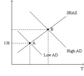
 -Refer to Figure 35-3. Assume the figure charts possible outcomes for the year 2018. In 2018, the economy is at point B on the left-hand graph, which corresponds to point B on the right-hand graph. Also, point A on the left-hand graph corresponds to A on the right-hand graph. The price level in the year 2018 is
(Multiple Choice)
4.9/5 (31)
As the aggregate demand curve shifts leftward along a given aggregate supply curve,
(Multiple Choice)
5.0/5 (41)
Refer to Monetary Policy in Flosserland. Suppose that the Flosserland Department of Finance undertakes a public relations campaign to convince people that it will soon change monetary policy to reduce inflation to 12.5%. If Flosserlanders believe their government then which, if any, curve(s) shift left?
(Multiple Choice)
4.8/5 (33)
Filters
- Essay(0)
- Multiple Choice(0)
- Short Answer(0)
- True False(0)
- Matching(0)