Exam 3: Determining Effective Data Display with Charts
Exam 1: Applying Fundamental Excel Skills and Tools in Problem Solving150 Questions
Exam 2: Solving Problems with Statistical Analysis Tools150 Questions
Exam 3: Determining Effective Data Display with Charts150 Questions
Exam 4: Applying Logic in Decision Making150 Questions
Exam 5: Retrieving Data for Computation, Analysis, and Reference150 Questions
Exam 6: Evaluating the Financial Impact of Loans and Investments150 Questions
Exam 7: Organizing Data for Effective Analysis150 Questions
Exam 8: Using Data Tables and Excel Scenarios for What If Analysis150 Questions
Exam 9: Enhancing Decision Making with Solver150 Questions
Exam 10: Troubleshooting Workbooks and Automating Excel Applications150 Questions
Select questions type
MATCHING
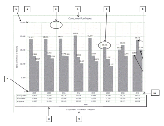 Using the above figure, identify the letter of the choice that best matches the figure.
-#9
Using the above figure, identify the letter of the choice that best matches the figure.
-#9
Free
(Multiple Choice)
4.8/5  (36)
(36)
Correct Answer: Verified
F
To control the display of individual labels in a chart, use the ____________________ options in Chart Elements.
Free
(Short Answer)
4.9/5 (36)
Correct Answer:Verified
Data Labels
Data labels
data labels
____ of the chart types have 3-D options, but these should be used with caution.
Free
(Multiple Choice)
4.7/5 (40)
Correct Answer:Verified
B
The values in a bubble chart type are indicated by the distance from a center point.
(True/False)
4.8/5 (35)
An X Y (Scatter) chart plots numeric values on both the x- and y-axes based on the value of the data.
(True/False)
4.9/5 (36)
The groundbreaking book by Edward R. ____________________, The Visual Display of Quantitative Information, gave advice such as "Above all else show the data."
(Short Answer)
4.8/5 (34)
The ____ option of splitting a pie data series into a second, smaller pie chart allows you to select a cutoff point that assigns all the values below that point to the second plot.
(Multiple Choice)
4.8/5 (34)
MATCHING
Using the above figure, identify the letter of the choice that best matches the figure.
-#7
(Multiple Choice)
4.8/5 (30)
Charts can successfully organize a large collection of numbers, make comparisons between different parts of the data, and tell a story.
(True/False)
4.8/5 (37)
To modify how gridlines display in a chart's plot area, use the ____________________ options in Chart Elements.
(Short Answer)
4.8/5 (35)
Microsoft Excel can be used to provide a visual representation of ____________________ information, giving the viewer an overall picture of a set of data.
(Short Answer)
4.7/5 (34)
____ graphically illustrate trends in the data using a statistical technique known as regression.
(Multiple Choice)
4.9/5 (28)
Identify the letter of the choice that best matches the phrase or definition.
-Bar chart type
(Multiple Choice)
4.9/5 (38)
In the Open-High-Low-Close chart sub-type, if the box is white, the stock increased in value for the time period. The white box is referred to as the ____.
(Multiple Choice)
4.7/5 (40)
The sum of the value of the categories must total ____ to use a pie chart.
(Multiple Choice)
5.0/5 (32)
MATCHING
Using the above figure, identify the letter of the choice that best matches the figure.
-#6
(Multiple Choice)
4.9/5 (35)
____ are the points in a data series at which the x-axis and y-axis values intersect.
(Multiple Choice)
4.7/5 (33)
MATCHING
Using the above figure, identify the letter of the choice that best matches the figure.
-#10
(Multiple Choice)
4.7/5 (39)
Identify the letter of the choice that best matches the phrase or definition.
-Column chart type
(Multiple Choice)
4.9/5 (33)
If the source data is dynamic, seeing the effect of the changes in a chart can be very handy. In this case, the chart should be placed ____.
(Multiple Choice)
4.9/5 (36)
Filters
- Essay(0)
- Multiple Choice(0)
- Short Answer(0)
- True False(0)
- Matching(0)