Exam 3: Determining Effective Data Display with Charts
Exam 1: Applying Fundamental Excel Skills and Tools in Problem Solving150 Questions
Exam 2: Solving Problems with Statistical Analysis Tools150 Questions
Exam 3: Determining Effective Data Display with Charts150 Questions
Exam 4: Applying Logic in Decision Making150 Questions
Exam 5: Retrieving Data for Computation, Analysis, and Reference150 Questions
Exam 6: Evaluating the Financial Impact of Loans and Investments150 Questions
Exam 7: Organizing Data for Effective Analysis150 Questions
Exam 8: Using Data Tables and Excel Scenarios for What If Analysis150 Questions
Exam 9: Enhancing Decision Making with Solver150 Questions
Exam 10: Troubleshooting Workbooks and Automating Excel Applications150 Questions
Select questions type
MATCHING
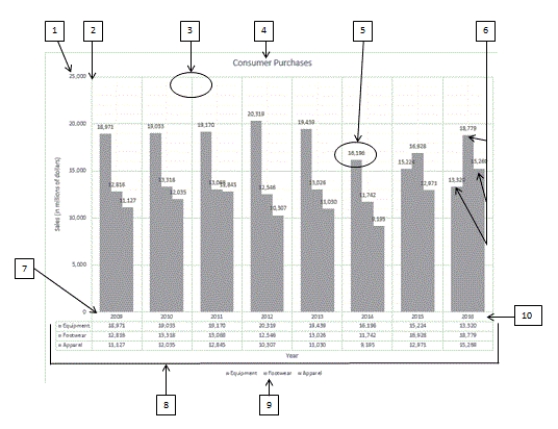 Using the above figure, identify the letter of the choice that best matches the figure.
-#3
Using the above figure, identify the letter of the choice that best matches the figure.
-#3
(Multiple Choice)
4.7/5  (43)
(43)
The chart title is the descriptive text that identifies the chart's contents.
_________________________
(True/False)
4.9/5 (39)
To display a moving average along with your chart data, use the ____________________ option in Chart Elements.
(Short Answer)
4.7/5 (40)
The ____________________ chart type displays value trends in three dimensions. Values are indicated by areas with colors or patterns on the surface of the chart.
(Short Answer)
4.8/5 (31)
The radar chart is similar in structure to a spider web, with each "web strand" that roughly
Forms a circle representing the ____.
(Multiple Choice)
4.9/5 (40)
MATCHING
Using the above figure, identify the letter of the choice that best matches the figure.
-#5
(Multiple Choice)
4.9/5 (37)
You must make changes to the content of data labels using buttons in the Format Data Labels task pane.
(True/False)
4.7/5 (43)
The Description options on the Chart Elements menu control the display and placement of the chart legend.
(True/False)
4.8/5 (39)
The Chart Elements menu allows you to control the appearance of the ____.
(Multiple Choice)
4.8/5 (42)
The ____ is the horizontal axis where categories are plotted.
(Multiple Choice)
4.9/5 (40)
A ____ chart displays trends in three dimensions, with values in colored or patterned areas on the surface of the chart.
(Multiple Choice)
4.9/5 (46)
A line chart plots numeric values on one axis and category labels equidistantly on the other axis.
(True/False)
4.9/5 (41)
The ____ chart type displays stock price and volume trends over time.
(Multiple Choice)
4.9/5 (39)
In a scatter chart and a bubble chart, the x- and y-axes ____.
(Multiple Choice)
4.9/5 (34)
The ____ option of splitting a pie data series into a second, smaller pie chart allows you to select a cutoff point by percentage, rather than value, and assign all the percentages below that point to the second plot.
(Multiple Choice)
4.8/5 (41)
The Data Labels category found on the Chart Elements menu provides options for changing the information the label displays as well as the label position. _________________________
(True/False)
4.7/5 (31)
Name and briefly describe five of the eleven chart types listed in the chapter.
(Essay)
4.9/5 (35)
Charts can be placed on a separate worksheet that is referred to as a ____.
(Multiple Choice)
4.9/5 (39)
The Alternative Data task pane, which is available from the shortcut menu for a selected chart, provides options for modifying the values used to generate a chart.
(True/False)
4.7/5 (36)
Filters
- Essay(0)
- Multiple Choice(0)
- Short Answer(0)
- True False(0)
- Matching(0)