Exam 3: Determining Effective Data Display with Charts
Exam 1: Applying Fundamental Excel Skills and Tools in Problem Solving150 Questions
Exam 2: Solving Problems with Statistical Analysis Tools150 Questions
Exam 3: Determining Effective Data Display with Charts150 Questions
Exam 4: Applying Logic in Decision Making150 Questions
Exam 5: Retrieving Data for Computation, Analysis, and Reference150 Questions
Exam 6: Evaluating the Financial Impact of Loans and Investments150 Questions
Exam 7: Organizing Data for Effective Analysis150 Questions
Exam 8: Using Data Tables and Excel Scenarios for What If Analysis150 Questions
Exam 9: Enhancing Decision Making with Solver150 Questions
Exam 10: Troubleshooting Workbooks and Automating Excel Applications150 Questions
Select questions type
The pie chart has two chart sub-types, ____ and Bar of Pie, which are smaller charts that are displayed next to the original chart.
(Multiple Choice)
4.9/5  (39)
(39)
MATCHING
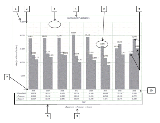 Using the above figure, identify the letter of the choice that best matches the figure.
-#1
Using the above figure, identify the letter of the choice that best matches the figure.
-#1
(Multiple Choice)
4.8/5 (39)
Generally, when a stock price moves above the moving average trendline, it is a good indicator
Of ____.
(Multiple Choice)
4.8/5 (36)
The ____ is the vertical axis where data values are plotted.
(Multiple Choice)
4.9/5 (36)
MATCHING
Using the above figure, identify the letter of the choice that best matches the figure.
-#8
(Multiple Choice)
4.8/5 (41)
In a ____ chart, values are indicated by the size of the slices.
(Multiple Choice)
4.7/5 (42)
A ____ is a word-sized chart embedded in context with the data it represents.
(Multiple Choice)
4.7/5 (37)
Many element-related Excel chart options are found on the Chart ____________________ menu.
(Short Answer)
4.7/5 (35)
In a worksheet, the MAX and MIN functions can be used to take care of the highest and lowest stock price, respectively, for each month. _________________________
(True/False)
4.9/5 (41)
A 100% stacked chart is similar to a ____ chart except that the pieces are in a column.
(Multiple Choice)
4.9/5 (41)
The ____ trendline is used to smooth out the data, making it easier to spot trends.
(Multiple Choice)
4.8/5 (32)
Use the Label options on the Chart Elements menu to display a table of values for each data series in a grid below the chart. _________________________
(True/False)
4.9/5 (43)
To create a forward forecast in Excel, adding a ____ to a chart may reveal trends in the data.
(Multiple Choice)
4.8/5 (41)
Excel offers two pie chart sub-types, Pie of Pie and Bar of Bar, that can be used to combine many smaller segments of a pie chart into a separate smaller chart. ________________________
(True/False)
4.8/5 (33)
To change the source data, click the Switch Row/Column button in the Data group on the CHART TOOLS ____ tab to open the Select Data Source dialog box.
(Multiple Choice)
4.9/5 (35)
MATCHING
Using the above figure, identify the letter of the choice that best matches the figure.
-#4
(Multiple Choice)
4.7/5 (38)
Identify the letter of the choice that best matches the phrase or definition.
-Doughnut chart type
(Multiple Choice)
4.8/5 (46)
The ____________________ is the descriptive text that identifies a chart's contents.
(Short Answer)
4.9/5 (35)
Identify the letter of the choice that best matches the phrase or definition.
-Line chart type
(Multiple Choice)
4.9/5 (36)
Filters
- Essay(0)
- Multiple Choice(0)
- Short Answer(0)
- True False(0)
- Matching(0)