Exam 3: Determining Effective Data Display with Charts
Exam 1: Applying Fundamental Excel Skills and Tools in Problem Solving150 Questions
Exam 2: Solving Problems with Statistical Analysis Tools150 Questions
Exam 3: Determining Effective Data Display with Charts150 Questions
Exam 4: Applying Logic in Decision Making150 Questions
Exam 5: Retrieving Data for Computation, Analysis, and Reference150 Questions
Exam 6: Evaluating the Financial Impact of Loans and Investments150 Questions
Exam 7: Organizing Data for Effective Analysis150 Questions
Exam 8: Using Data Tables and Excel Scenarios for What If Analysis150 Questions
Exam 9: Enhancing Decision Making with Solver150 Questions
Exam 10: Troubleshooting Workbooks and Automating Excel Applications150 Questions
Select questions type
To change the thickness of a pie slice, change the value of the degree in the ____________________ box in the Format Chart Area task pane.
(Short Answer)
4.8/5  (37)
(37)
Case 3-2
By Columns By Rows
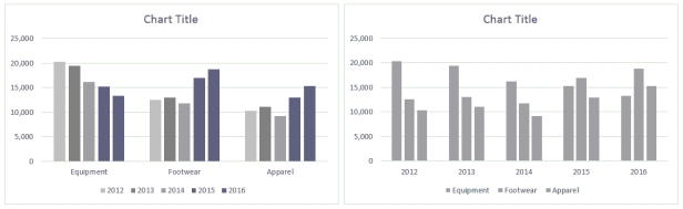 Ross always looks at data in more than one way. He discovered a feature in Excel that allows him to display the chart By Column and By Rows, as shown in the above figure.
-To create the comparison shown in the above figure, Ross used the Switch Row/Column button in the ____ group.
Ross always looks at data in more than one way. He discovered a feature in Excel that allows him to display the chart By Column and By Rows, as shown in the above figure.
-To create the comparison shown in the above figure, Ross used the Switch Row/Column button in the ____ group.
(Multiple Choice)
4.7/5 (33)
A(n) ____ chart plots numeric values on both the x- and y-axes based on the value of the data.
(Multiple Choice)
4.8/5 (44)
____ got their name because they display performance indicators in a fashion similar to the instrument panel in a car's dashboard.
(Multiple Choice)
4.8/5 (42)
Radar charts are like area charts-but whereas area charts emphasize the amount of the contribution, radar charts emphasize ____.
(Multiple Choice)
4.9/5 (37)
One of the features of 100% stacked charts is that they show ____ percentages.
(Multiple Choice)
4.9/5 (41)
When the chart is plotted by rows, what information does it emphasize?
(Multiple Choice)
4.8/5 (41)
The column chart's default column chart sub-type is the _____ sub-type.
(Multiple Choice)
4.7/5 (34)
A management console shows a visual summary of various performance data that a company's managers use on a regular basis. _________________________
(True/False)
4.8/5 (32)
An X Y (____________________) chart plots numeric values on both the x- and y-axes based on the value of the data.
(Short Answer)
4.9/5 (38)
Charts can be embedded as a(n) ____ on the same worksheet as the source data for the chart.
(Multiple Choice)
4.8/5 (32)
Regresslines graphically illustrate trends in the data using a statistical technique known as regression. _________________________
(True/False)
4.8/5 (38)
To change the chart sub-type, click the Change Chart Type button in the ____ group on the CHART TOOLS DESIGN tab.
(Multiple Choice)
4.7/5 (41)
The ____ option of splitting a pie data series into a second, smaller pie chart assigns a specific number of values to the second plot.
(Multiple Choice)
4.9/5 (35)
Bar and column charts are commonly used to compare values across categories.
(True/False)
5.0/5 (38)
If Sarah wanted to focus on and display the percentage contribution that each category makes to the whole, which chart type would work best?
(Multiple Choice)
4.8/5 (41)
With the ____ sub-type, the data to be plotted must be placed by column in this order: high stock value for the day, low stock value, and, finally, closing stock value.
(Multiple Choice)
4.9/5 (43)
To change the chart sub-type, click the chart to display the CHART TOOLS contextual tabs on the ribbon, click the CHART TOOLS ___________ tab, and then click the Change Chart Type button in the Type group.
(Short Answer)
4.8/5 (32)
Case-Based Critical Thinking Questions
Case 3-1
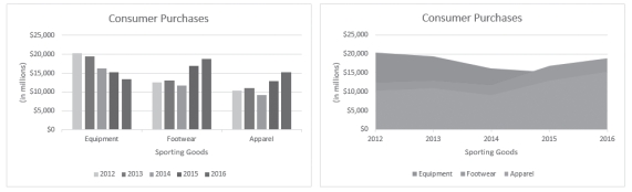 Column Chart Area Chart
Sarah has put together the same information in two different charts, shown in the figure above, to present to her boss. She is thinking through the pros and cons of each chart type.
-Which chart does a better job of illustrating the collective sales trend in the Equipment, Footwear, and Apparel categories over the eight years?
Column Chart Area Chart
Sarah has put together the same information in two different charts, shown in the figure above, to present to her boss. She is thinking through the pros and cons of each chart type.
-Which chart does a better job of illustrating the collective sales trend in the Equipment, Footwear, and Apparel categories over the eight years?
(Multiple Choice)
4.8/5 (32)
Filters
- Essay(0)
- Multiple Choice(0)
- Short Answer(0)
- True False(0)
- Matching(0)