Exam 9: Plots, Graphs, and Pictures
Exam 1: The Benefits and Risks of Using Statistics30 Questions
Exam 2: Reading the News50 Questions
Exam 3: Measurements, Mistakes, and Misunderstandings44 Questions
Exam 4: How to Get a Good Sample60 Questions
Exam 5: Experiments and Observational Studies60 Questions
Exam 6: Getting the Big Picture22 Questions
Exam 7: Summarizing and Displaying Measurement Data54 Questions
Exam 8: Bell-Shaped Curves and Other Shapes34 Questions
Exam 9: Plots, Graphs, and Pictures57 Questions
Exam 10: Relationships Between Measurement Variables35 Questions
Exam 11: Relationships Can Be Deceiving36 Questions
Exam 12: Relationships Between Categorical Variables36 Questions
Exam 13: Statistical Significance for 2 2 Tables33 Questions
Exam 14: Understanding Probability and Long-Term Expectations42 Questions
Exam 15: Understanding Uncertainty Through Simulation13 Questions
Exam 16: Psychological Influences on Personal Probability30 Questions
Exam 17: When Intuition Differs From Relative Frequency30 Questions
Exam 18: Understanding the Economic News23 Questions
Exam 19: The Diversity of Samples From the Same Population49 Questions
Exam 20: Estimating Proportions With Confidence31 Questions
Exam 21: The Role of Confidence Intervals in Research40 Questions
Exam 22: Rejecting Chancetesting Hypotheses in Research43 Questions
Exam 23: Hypothesis Testingexamples and Case Studies25 Questions
Exam 24: Significance, Importance, and Undetected Differences38 Questions
Exam 25: Meta-Analysis: Resolving Inconsistencies Across Studies23 Questions
Exam 26: Ethics in Statistical Studies29 Questions
Exam 27: Putting What You Have Learned to the Test46 Questions
Select questions type
Name two of the five most common problems in plots, graphs and pictures.
(Essay)
4.8/5  (35)
(35)
For Questions use the following narrative:
Narrative: Average hourly earnings
The graph below, done in 1998 by the Bureau of Labor Statistics, represents the average hourly earnings of U.S.workers from 1947-1998 (in 1998 dollars).
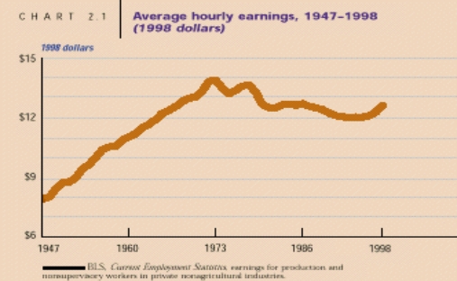 -{Average hourly earnings narrative} The designers of this graph expressed all their data in terms of 1998 dollars.Explain why they did this, and whether or not you think this is a good idea.
(Essay)
4.8/5 (32)
Explain why it is not wise to forecast a trend very far into the future.
(Essay)
4.8/5 (36)
A(n) __________ is useful for displaying the relationship between two measurement variables.
(Short Answer)
4.9/5 (29)
Measurement data displayed in terms of how they change over time can not be represented by what type of statistical picture?
(Multiple Choice)
4.7/5 (39)
Which of the following describes the result of seasonally adjusting a time series (such as the unemployment rate)?
(Multiple Choice)
4.9/5 (40)
Name a situation in which a scatterplot is most useful for displaying measurement data.
(Essay)
4.8/5 (39)
Which of the following is not a characteristic of a good plot, graph, or picture of data?
(Multiple Choice)
4.8/5 (42)
Which of the following does not describe a time series plot with an irregular cycle?
(Multiple Choice)
4.9/5 (28)
For Questions use the following narrative:
Narrative: Average hourly earnings
The graph below, done in 1998 by the Bureau of Labor Statistics, represents the average hourly earnings of U.S.workers from 1947-1998 (in 1998 dollars).
-{Average hourly earnings narrative} Describe the scale used on the vertical axis and whether or not it is appropriate.
(Essay)
4.9/5 (38)
Name 3 of the 12 questions you should ask when you look at a statistical picture, before trying to interpret it.
(Essay)
4.9/5 (42)
Although a scatterplot can be more difficult to read than a line graph, it displays more information.Explain why.
(Essay)
4.7/5 (38)
Filters
- Essay(0)
- Multiple Choice(0)
- Short Answer(0)
- True False(0)
- Matching(0)