Exam 2: Frequency Distributions and Graphs
Exam 1: The Nature of Probability and Statistics54 Questions
Exam 2: Frequency Distributions and Graphs83 Questions
Exam 3: Data Description101 Questions
Exam 4: Discrete Probability Distributions79 Questions
Exam 5: The Normal Distribution84 Questions
Exam 6: Confidence Intervals and Sample Size76 Questions
Exam 7: Hypothesis Testing90 Questions
Exam 8: Testing the Difference Between Two Means, Two Proportions, and Two Variances74 Questions
Exam 9: Correlation and Regression83 Questions
Exam 10: Chi-Square and Analysis of Variance Anova71 Questions
Exam 11: Tables71 Questions
Exam 12: Data Bank91 Questions
Exam 13: Glossary68 Questions
Select questions type
One disadvantage of pie charts is that it is difficult to visually compare 2 frequency distributions. Plotting
relative frequency distributions (polygons or ogives) on the same axes is usually more informative.
(True/False)
4.9/5  (36)
(36)
In order to graphically compare two frequency distributions, one should use relative frequency
distributions in order to take differing sample sizes into account.
(True/False)
4.8/5 (30)
When data are collected in original form, they are called __________.
________________________________________
(Short Answer)
4.7/5 (28)
Karen is constructing a pie graph to represent the number of hours her classmates do homework each day. She found that did homework for three hours each day. In her pie graph, this would represent how
Many degrees?
(Multiple Choice)
4.7/5 (31)
Thirty students recorded the colours of their eyes, choosing from the colours brown, blue, green, hazel, and black. This data can be appropriately summarized in a
(Multiple Choice)
4.9/5 (34)
A time series graph represents data that occur over a specific period.
(True/False)
4.8/5 (26)
The cumulative frequency is the sum of the frequencies accumulated to the upper boundary of a class in
the distribution.
(True/False)
4.8/5 (34)
A histogram uses the midpoints for the x values and the frequencies as the y values.
(True/False)
4.7/5 (34)
Which of the following could be a cumulative frequency graph?
(Multiple Choice)
4.9/5 (32)
The graphs that have their distributions as proportions instead of raw data as frequencies are called
(Multiple Choice)
4.8/5 (36)
A time series graph is useful for which of the following purposes?
(Multiple Choice)
4.9/5 (39)
A Pareto chart does not have which of the following properties?
(Multiple Choice)
4.8/5 (45)
For the table below, calculate the percent of students that fell within the B
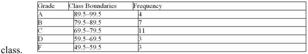
(Multiple Choice)
4.9/5 (42)
The lower class limit represents the smallest data value that can be included in the class.
(True/False)
4.7/5 (32)
An automobile dealer wants to construct a pie graph to represent types of cars sold in July. He sold 72 cars; 16 of which were convertibles. The convertibles will represent how many degrees in the circle?
(Multiple Choice)
4.9/5 (32)
Filters
- Essay(0)
- Multiple Choice(0)
- Short Answer(0)
- True False(0)
- Matching(0)